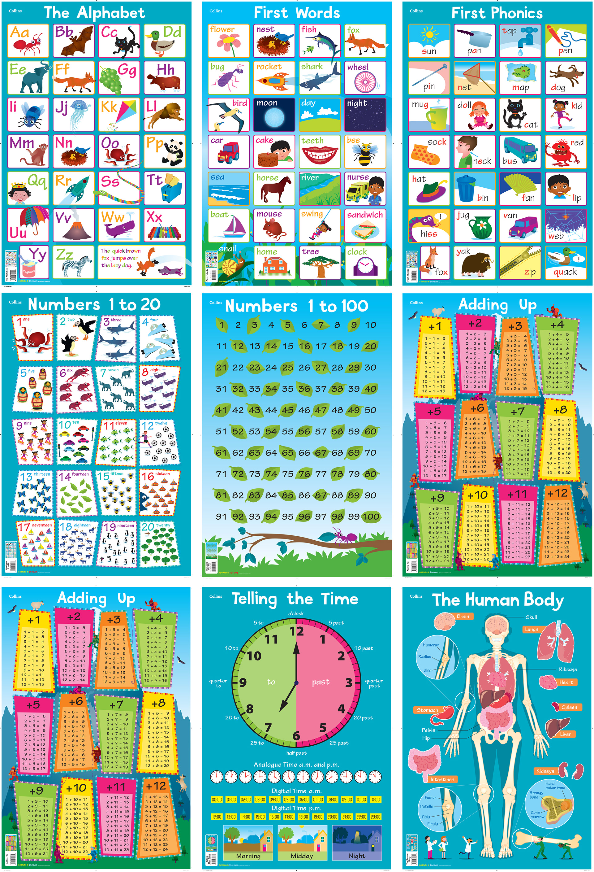
After the success of the Collins World Map, Picture Atlas and Map of the United Kingdom and Ireland, I was commissioned to produce a series of 11 posters. This was an open brief, apart from the 'phonics' posters content and quite a challenge.
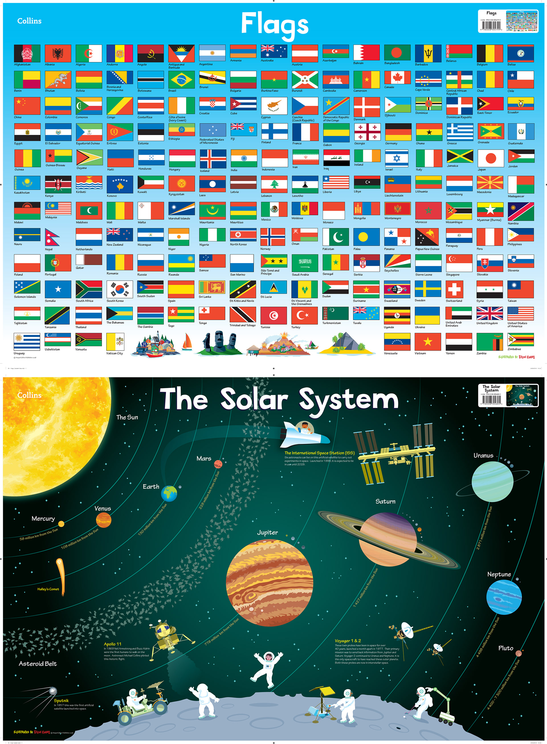
Collins were very keen on using the 'teal' colour for the background for as many posters as possible to give the feel of them being a series. This colour, a favourite of mine, I introduced as the sea colour in the World Map and map of the UK. I find it a much warmer colour than the cold blue usually used for maps.
This poster took the most to create. We went from detailed organs to very simple designs. In the end I chose a muted palette and introduced characters to make the poster more friendly for the target audience. The human body can be scary!
I had read about the 'Dippy the Dinosaur Tour' happening around the UK, and this gave me an idea of the skeleton in this poster being a museum exhibit, a very large museum exhibit as it turned out.
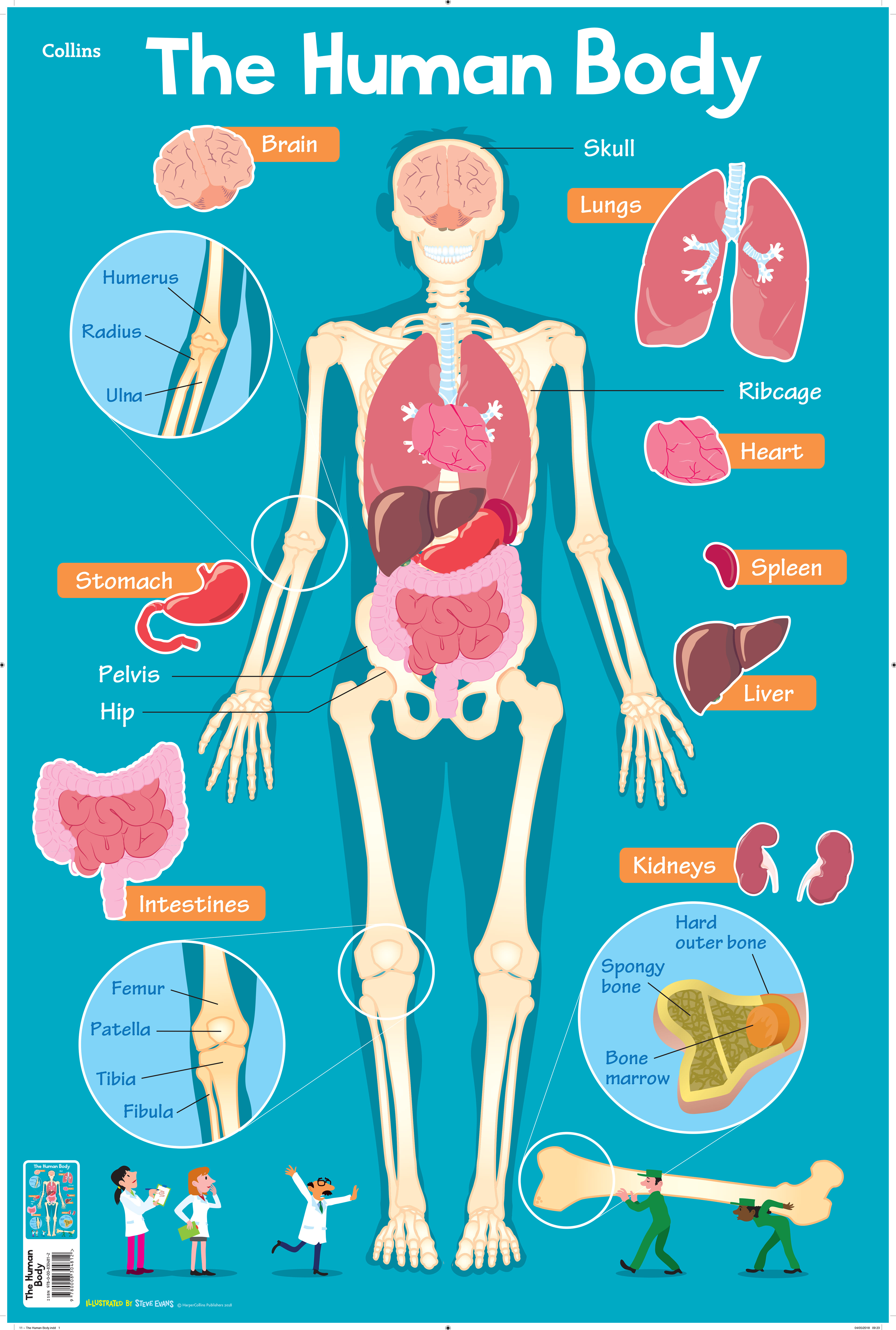
My favourite of all of the posters.

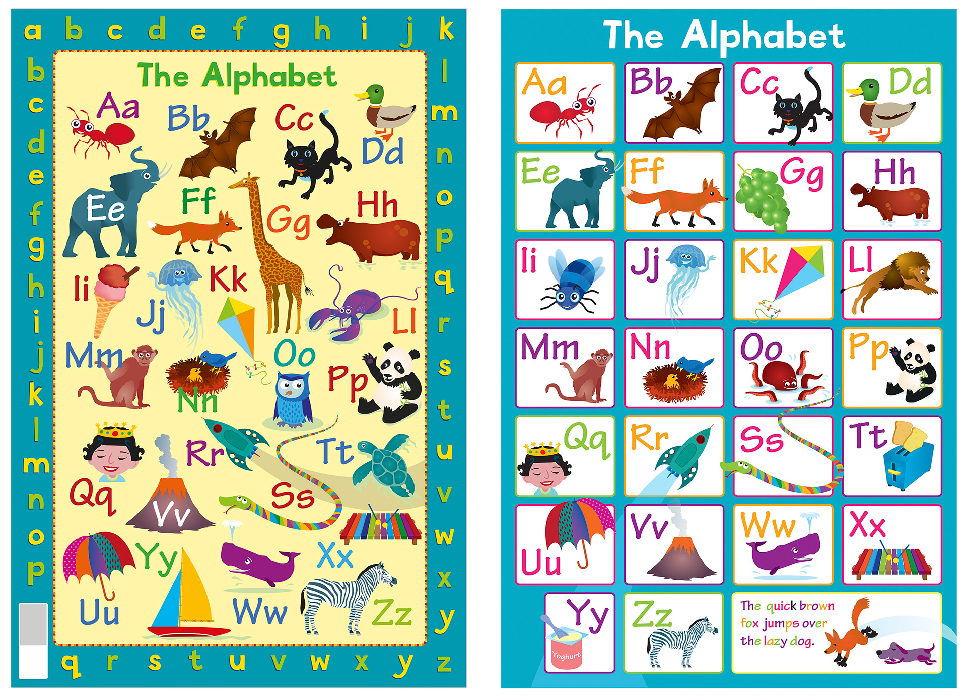
The infant lettering design I originally produced for the World Map and cover of the Collins Picture Atlas and later to be used throughout the poster series.
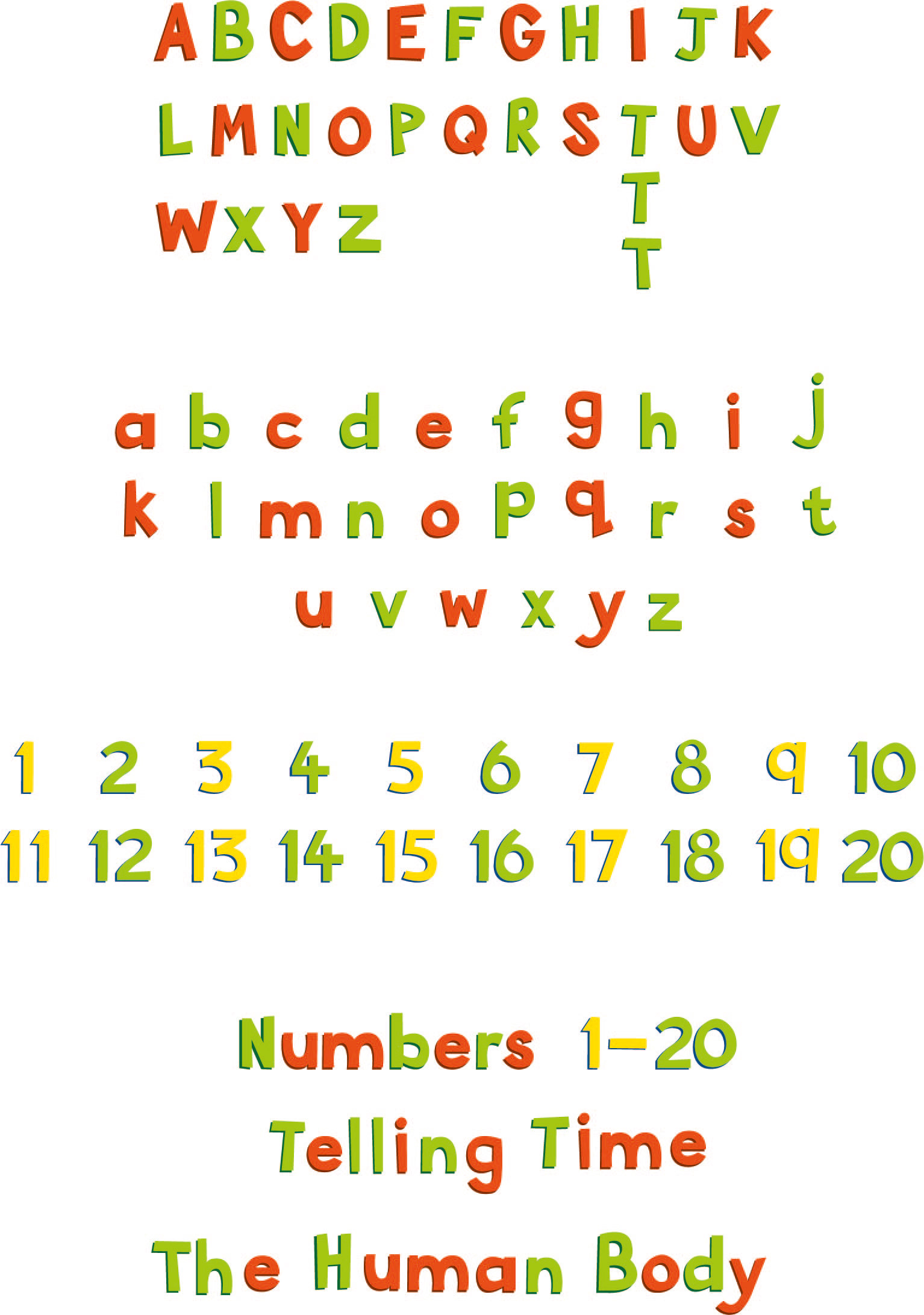
The first brief for the series was to design a border for the 'Alphabet and phonics' posters. A number version was produced for the 'addition' and 'times tables' posters.
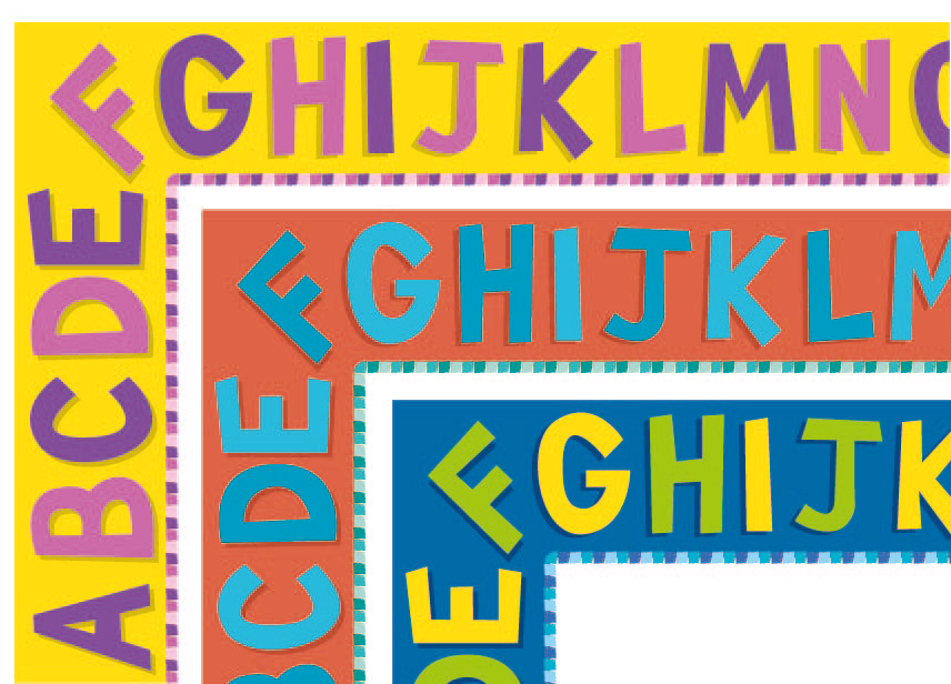
The first of the 11 posters. The poster on the left shows the alphabet border. This was deemed too complicated for the market age (3-8) and was later discarded for a cleaner, more eye catching look. The compartmentalised structure was considered easier on the eye.
I do prefer the original on the left though, with the elements flowing around each other. Creating it was like completing a puzzle. Great fun. Some of the elements were changed for phonic reasons. The 'g' sound of the Giraffe was incorrect for a children's first phonics poster, so was replaced by the more appropriate 'grapes'.