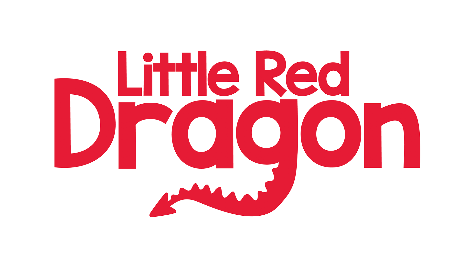
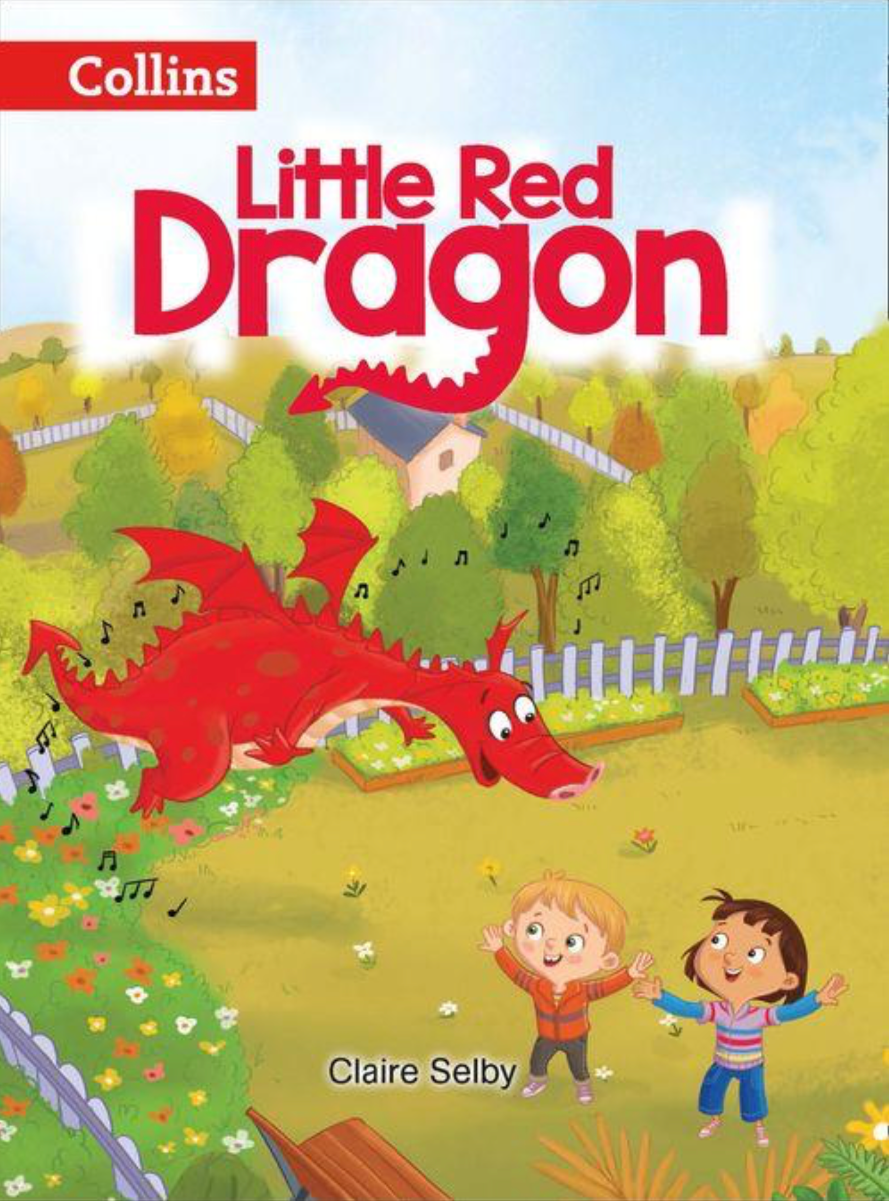
From the brief I very quickly came up with the logo with a simple infant typeface. The tail of the 'g' in 'dragon' was clearly made to be adapted to a dragon's tail.
I showed the client two versions with the tail in different sizes.
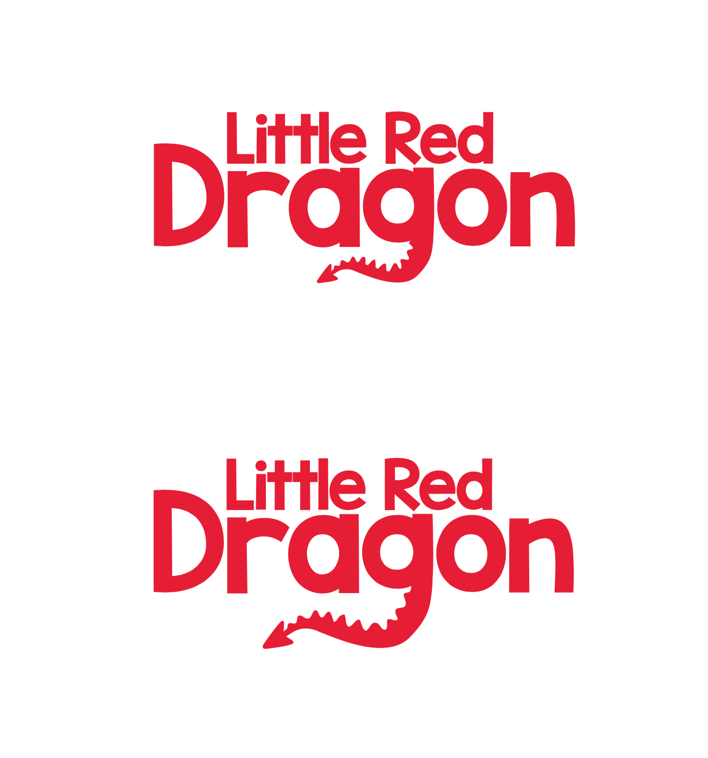
Collins went with the larger tail which does look like a nicer balanced shape.
I was requested to put the logo in to a lozenge with the tail dangling. There was a problem of the tail clashing with the image behind the tail, but it was still legible to a point and was given the go ahead for use.
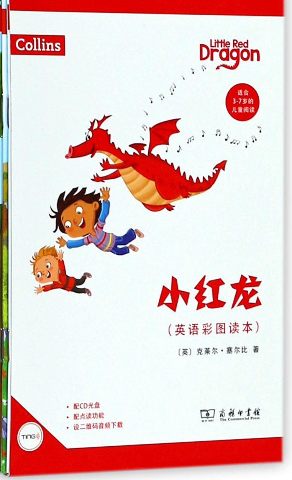
The first book with the new logo as the title of the book.
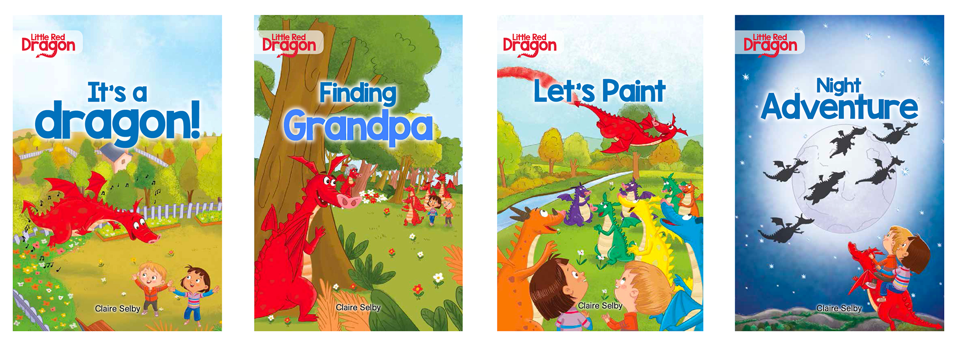
The logo has since been used on international products.