
I've shown the process of producing the cover for the Collins Picture Atlas. Here is how the internal pages were designed and produced by myself, Kevin Robbins, head designer at Collins (Glasgow division) and Anne Mahon, the Managing Editor for this project.
This first image shows a kind of mood board I was asked to produce to be presented to Kevin and Anne for a meeting at Harper Collins, Glasgow. They were very happy with the style of content and the exciting colours of each country. I had created just enough of a brightness and charm that the team had imagined for this title.
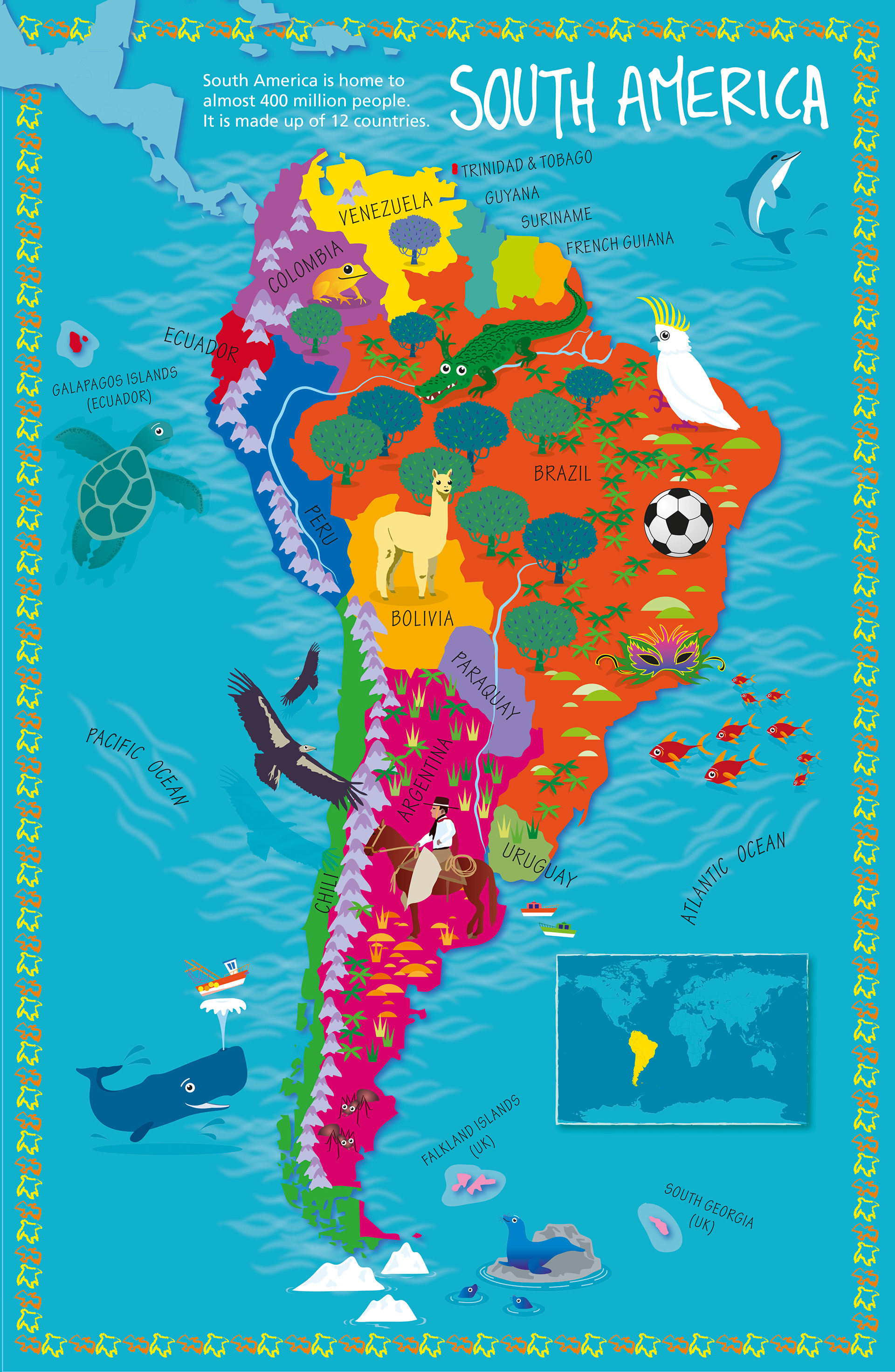
After their feedback, I amended the design to be less cluttered and with the stripey border, that Anne had really liked, to be reused around the location map at the bottom of the page.
Amazingly, this sample was used for the final design for South America that went to print.
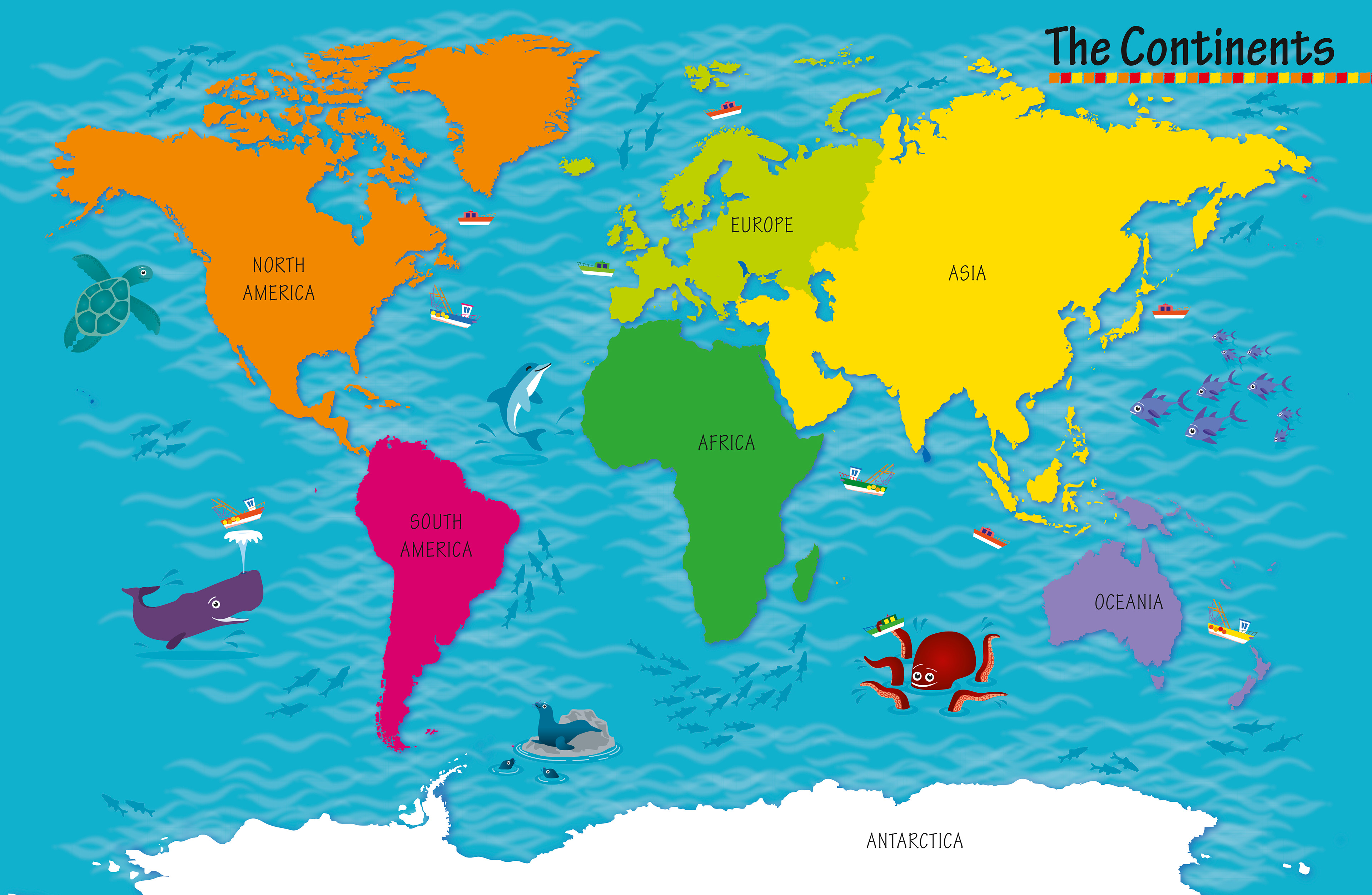
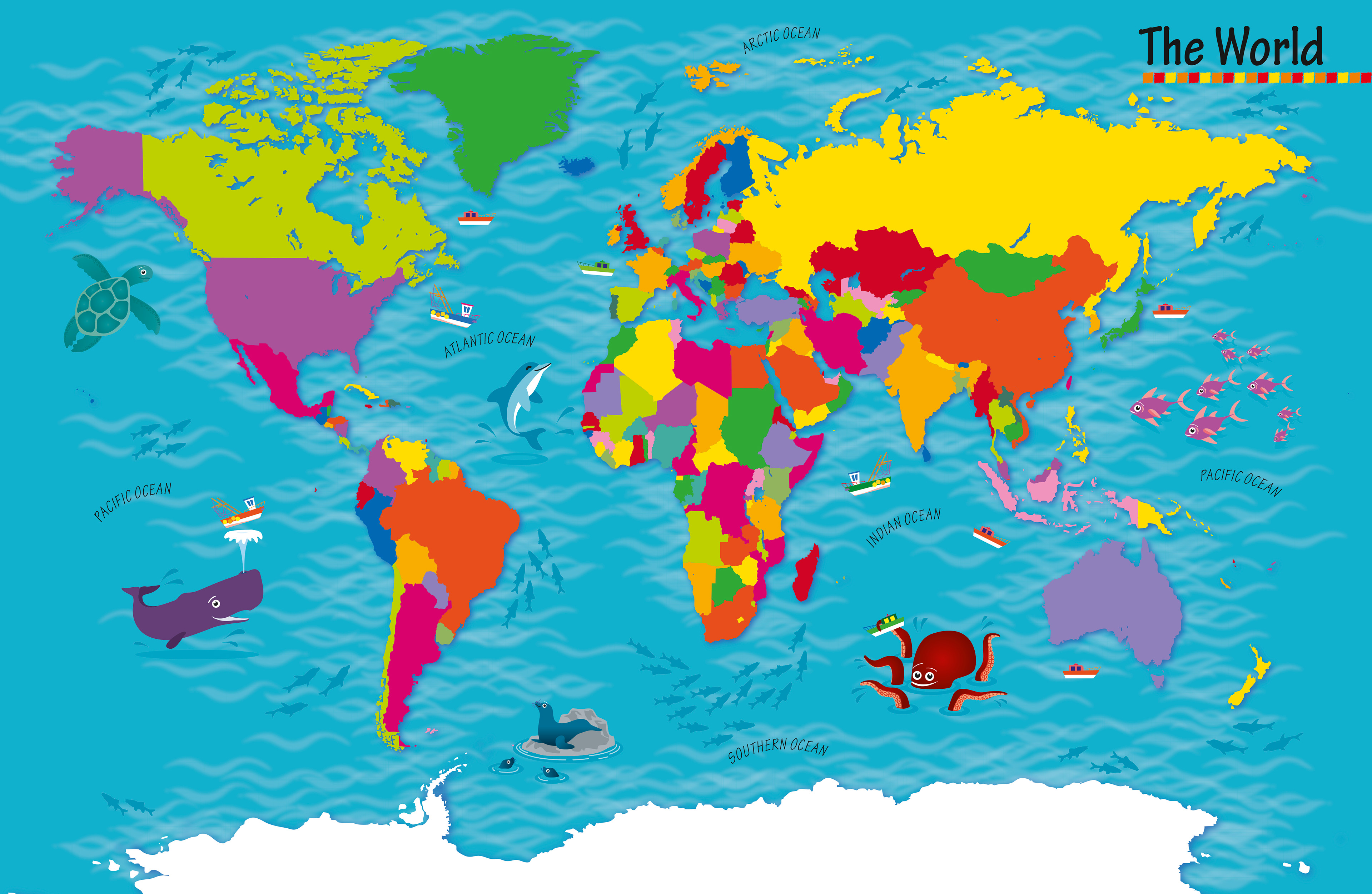
I was then asked to produce global maps to show how colours would be used to distinguish each country from each other. This only became complicated around the continent of Europe with so many different countries in such a small area.
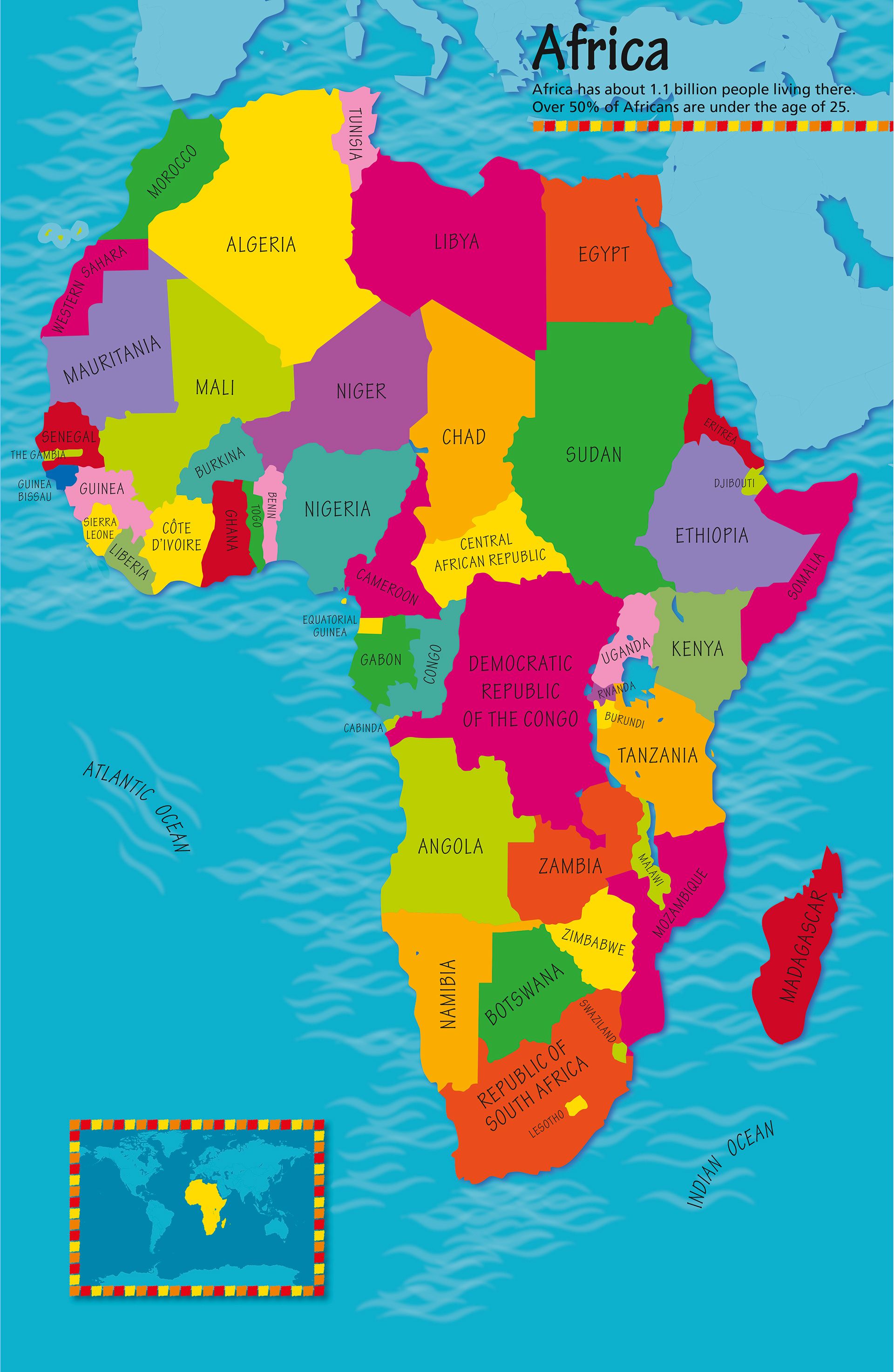
Next I was asked to produce the map for Africa to see how strong the design and style of the book would carry throughout the pages. It was also needed to be tested at the Stuttgart Book fair.
I then started sketching the animals that would appear in the Africa spread.
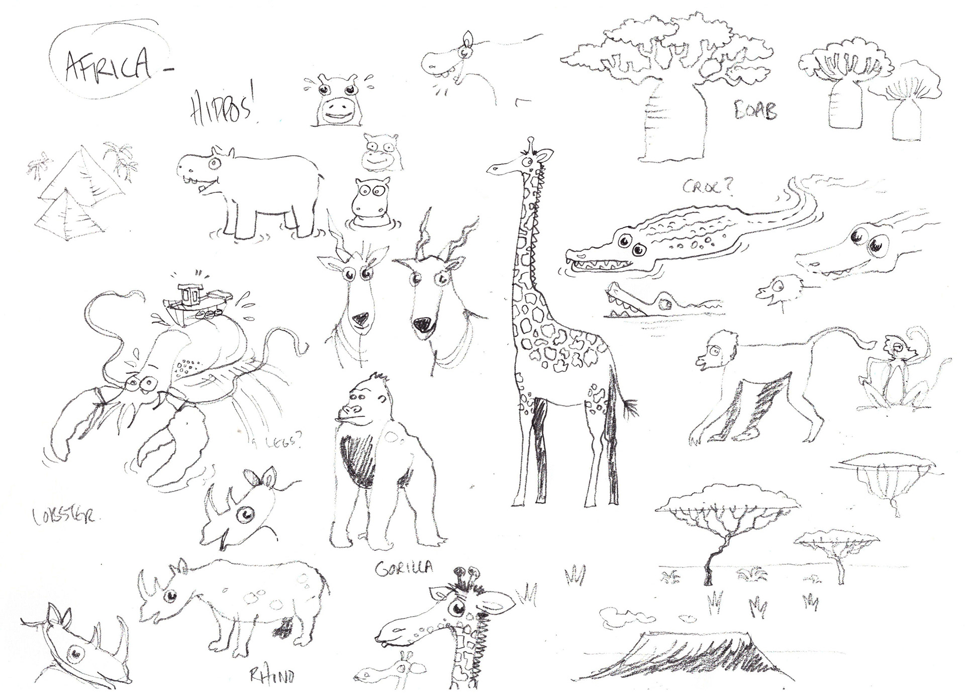
At first I thought the lobster needed his legs showing. I found this too spider-like though and left them out. I loved caricaturing the rhino head anto something that is completely different but also so like a rhino head.
Here is Africa with new artwork included. I was asked to try the land from other continents with a different contrasting colour, but eventually this beige was considered too strong on the page and detracted from the main art. Kevin and Anne also toyed with the idea of this image being used for the cover but they decided they wanted the cover to stand out from it's competitors by not having a map or global on the cover.
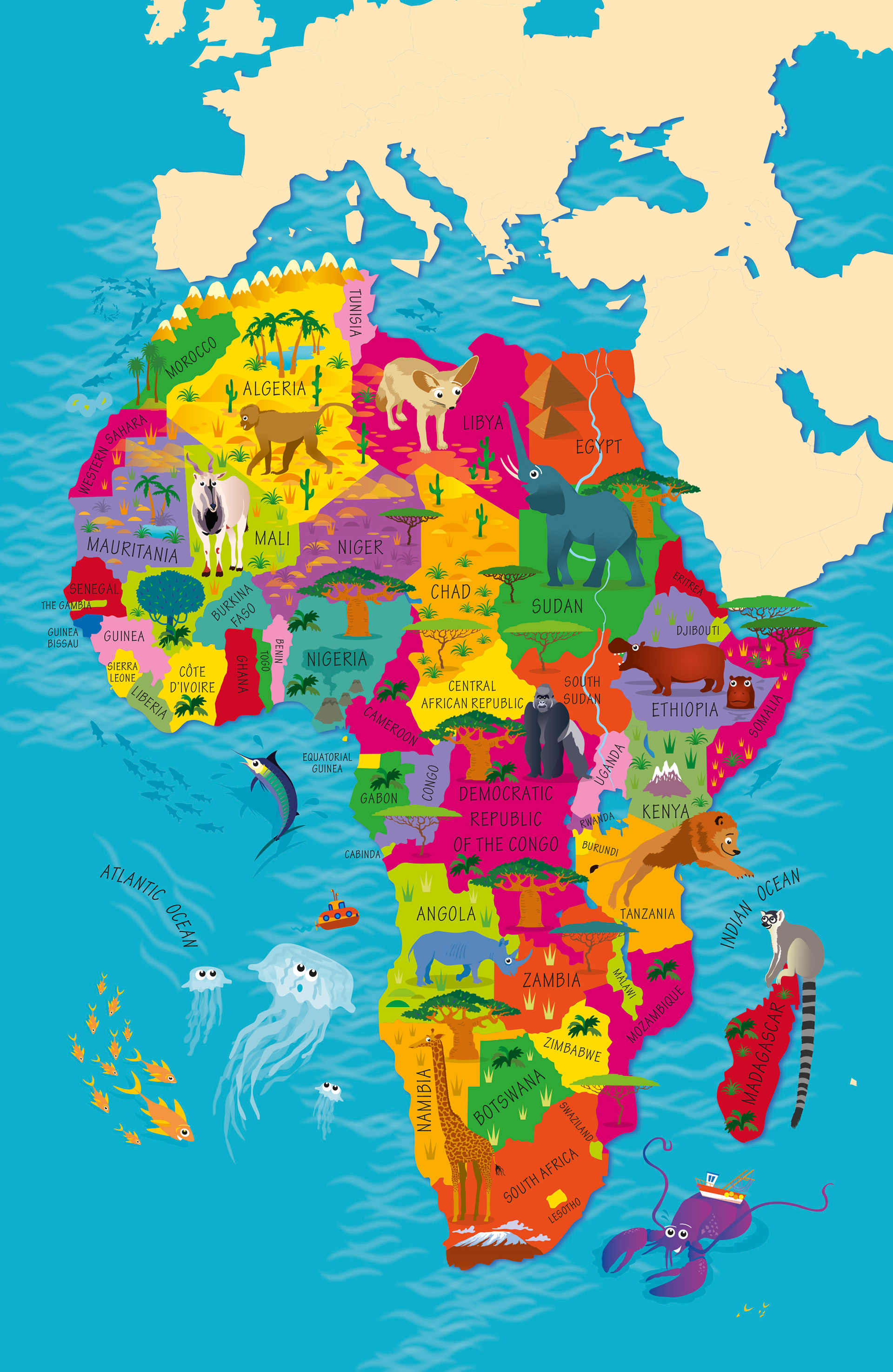
Here is the final design. There is one exception to the original design, the Desert Fox in Libya was replaced by oil wells.

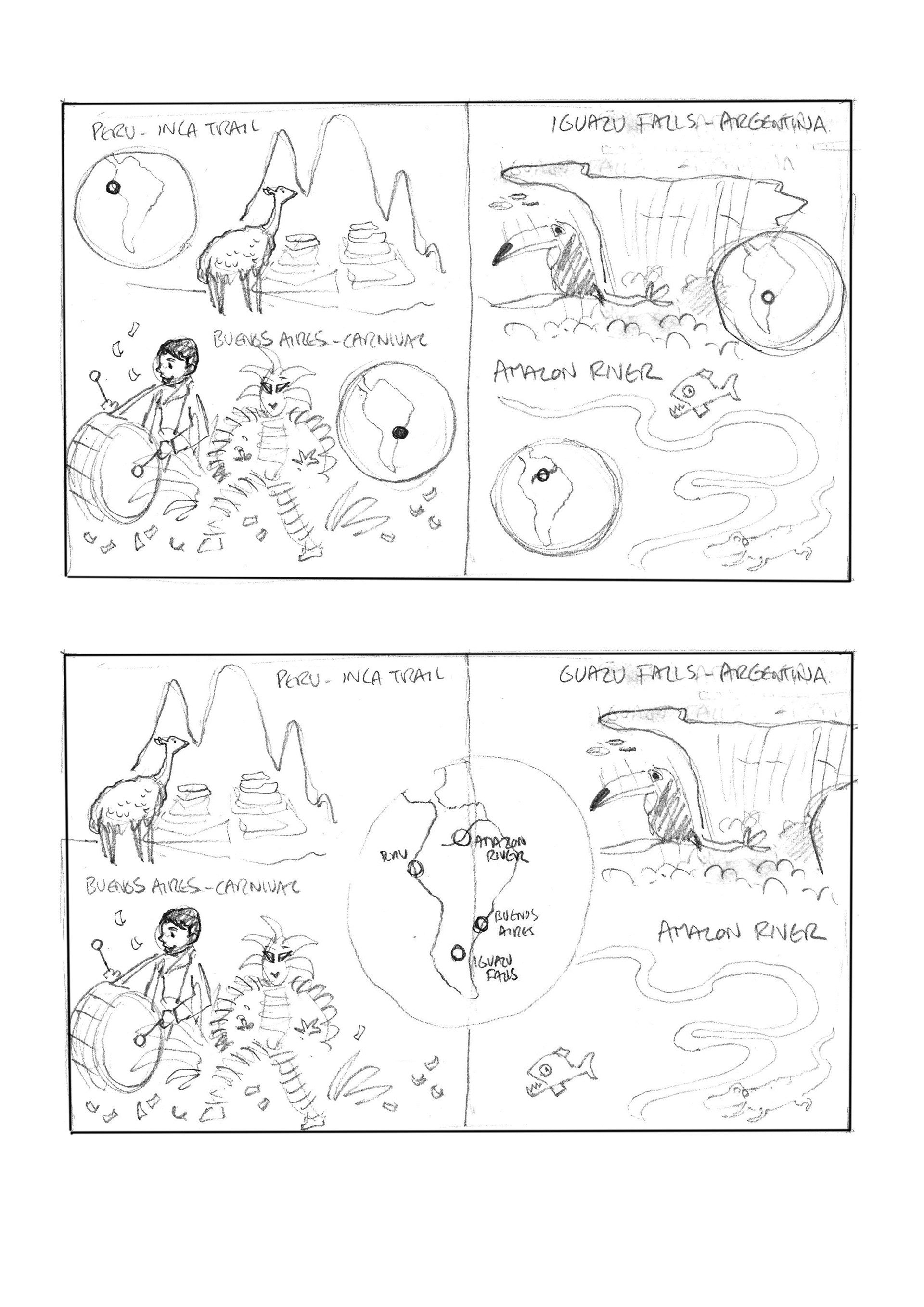
With each continent there would be two to three 'essence' pages. These pages would contain fun facts that would represent the essence of each continent with supportive illustrations. Below are two ideas I had of how these pages would look.
The the two sketches show how a location map could be incorporated into the spread. Either there would be a location map for each fact or one map showing all locations for the facts. Anne decided just one location map would be enough on the page which would make the spreads look less cluttered and confusing.
I was asked to source the material for the 'facts' of the book in their entirety. I was quite amazed to be given carte blanche on such an important title for this new Collins children's atlas. I got carried away with finding the most extravagant and amazing facts, and I forgot that I would also need to illustrate them!
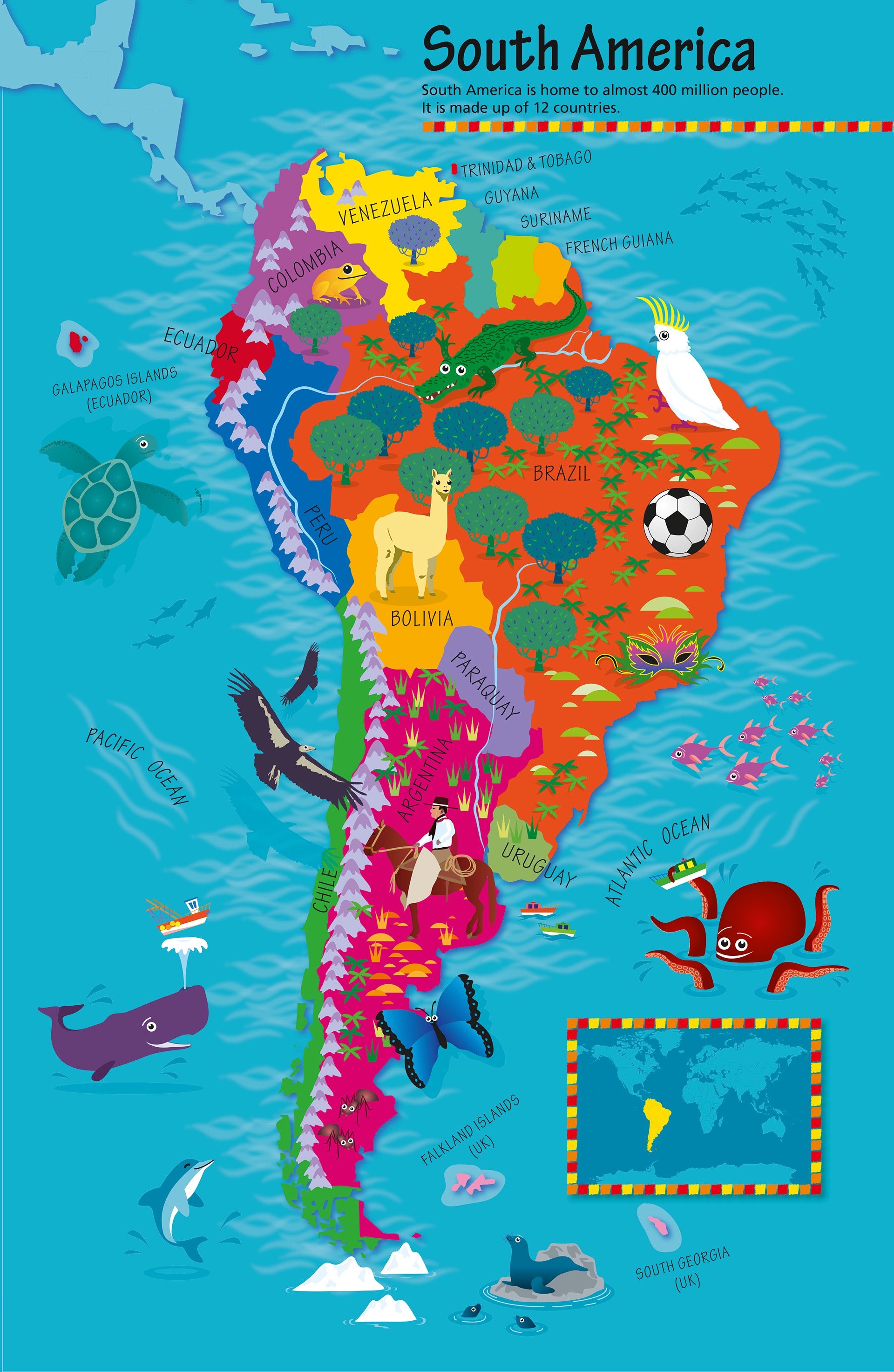
Here are the two final South America 'essence' spreads, one for southern South America and the other for northern South America.
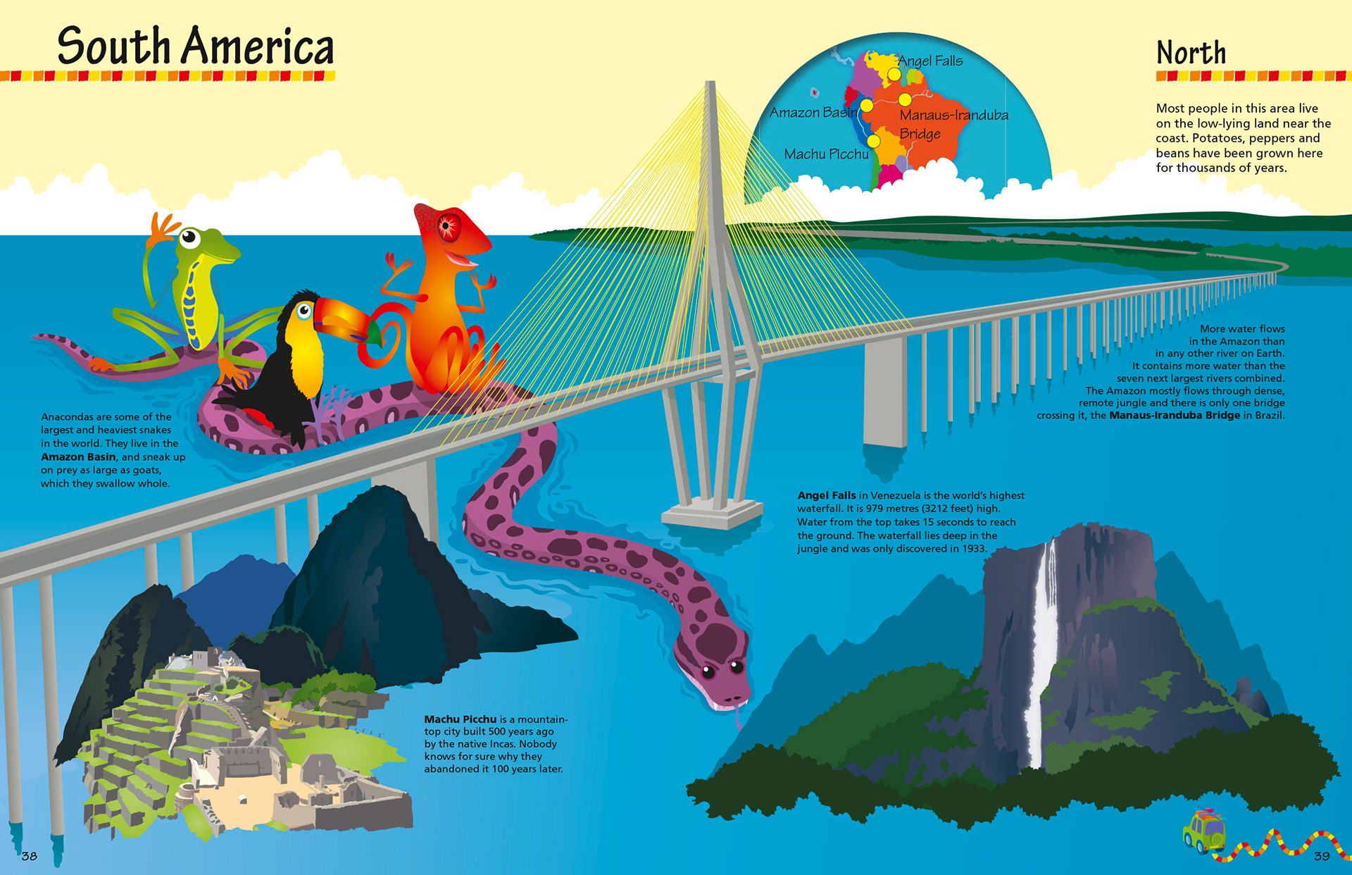
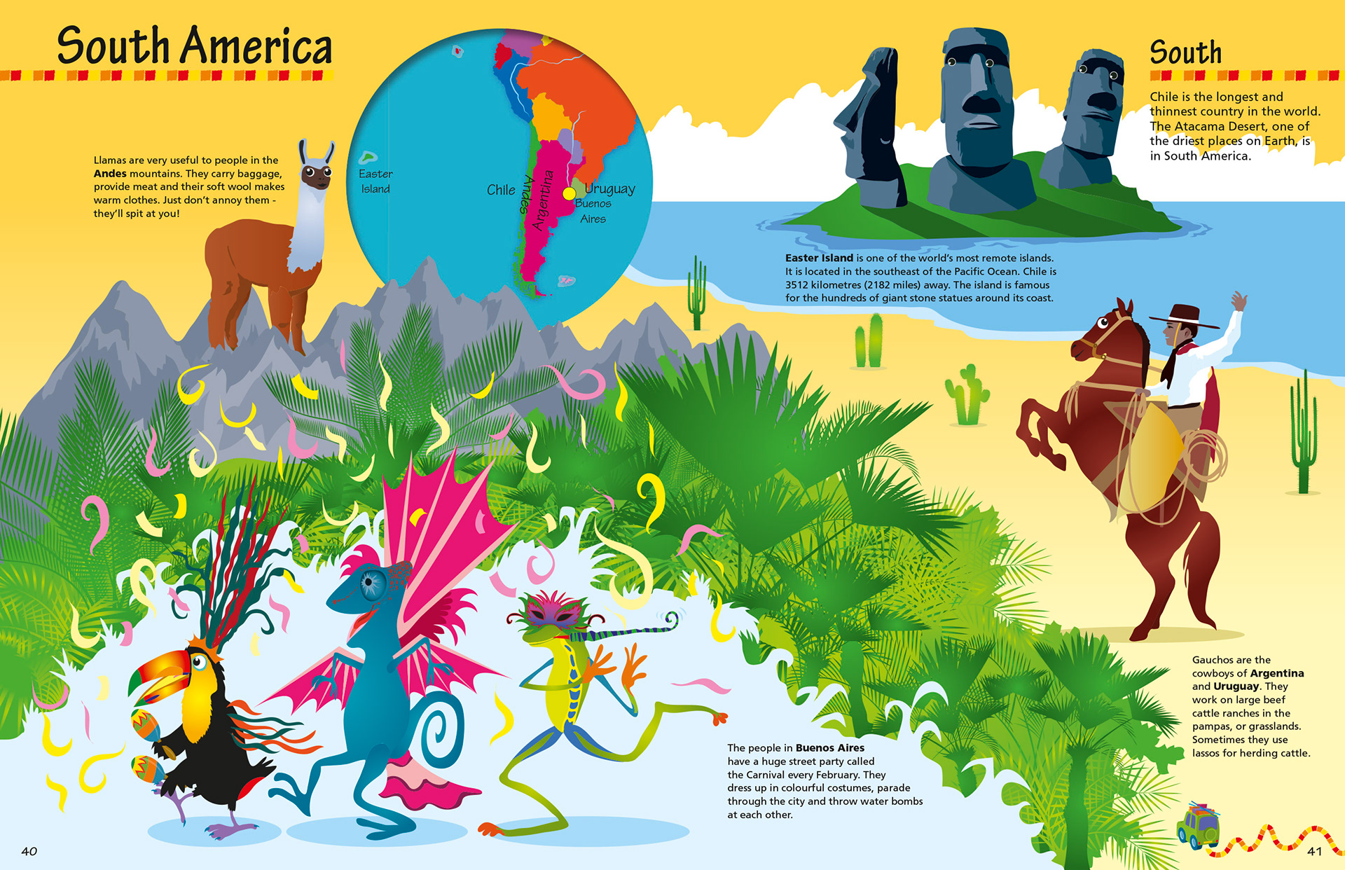
I don't know where the three indigenous characters of the tree frog, toucan and chameleon came from, but I'm glad I decided to include them in both spreads. Almost seeing their journey south, which is what the book is all about, journeys.