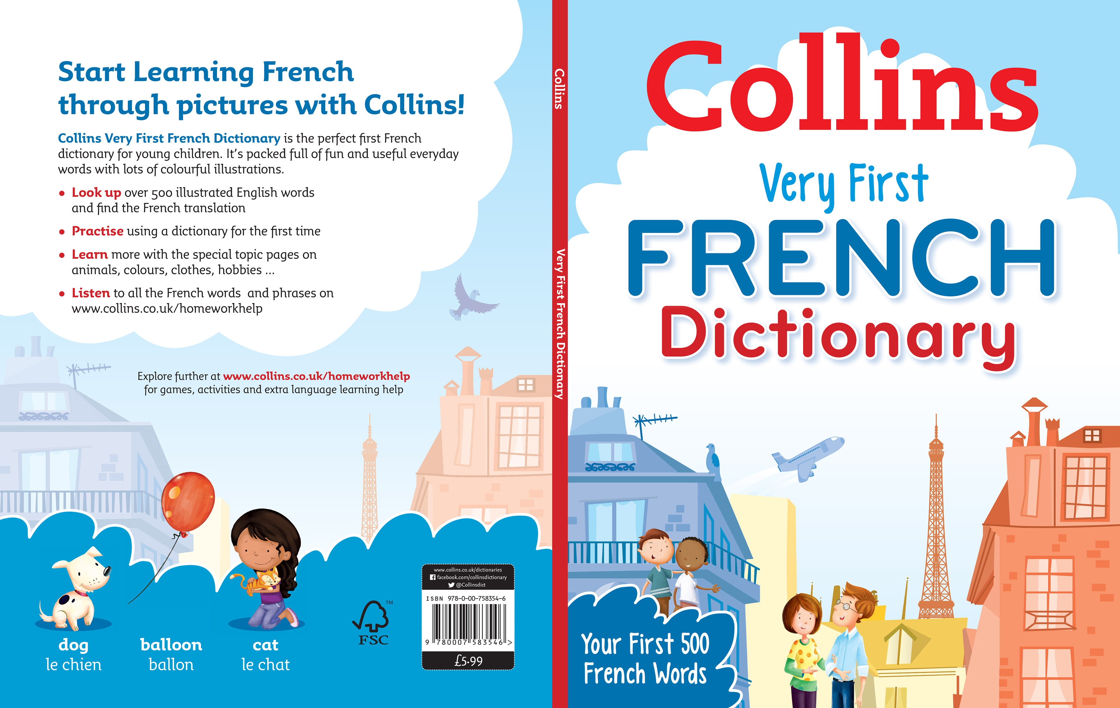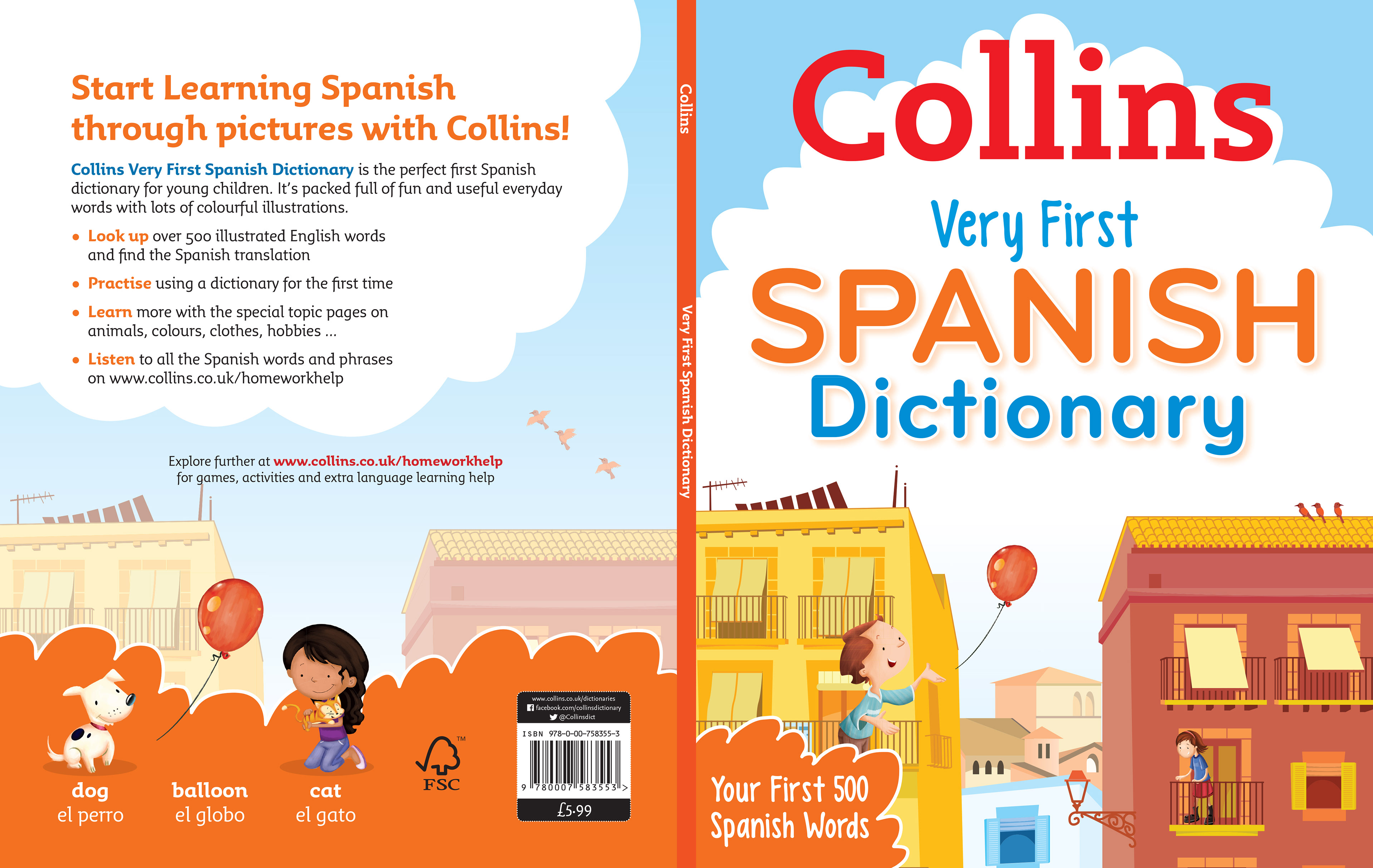
Primary French, Spanish and Irish Dictionary covers for Harper Collins.
This artwork was initially briefed for a '300 First Words' title which subsequently went on hold indefinately.
The client loved the street scene and decided to use it for the cover of the 'Very First French Dictionary'. This also meant I then needed to come up with a typical but stylised street scene for the Spanish and Irish titles.
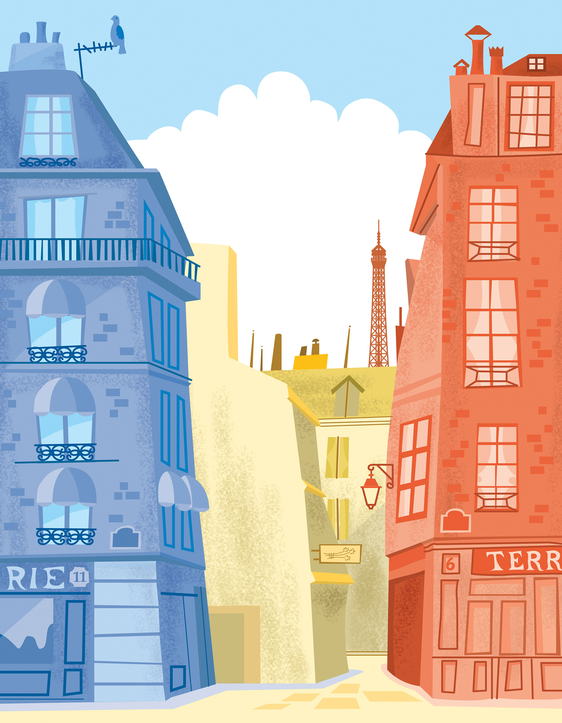
This is the backdrop for the cover. Main titles were added in the white space cloud area. Also characters from the internals by another illustrator were added.
As it is a French dictionary I wanted to find a way of showing the French flag colours in a subtle way that wouldn't be immediately obvious. I first drew the artwork with the blue, white, red. with no other colour in the middle. It just didn't work. I think the yellow of the central buildings softens the contrast between the blue and red buildings. I also love the glimpse of the Eiffel Tower in the background.
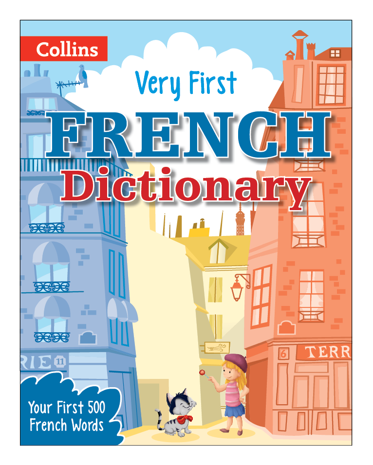
Apart from a few tweaks, this is the final design for the French cover. Not much has changed, although the Eiffel Tower is now much lower in the distance. I decided to also remove the textured fill from the original keeping everything fresh and clean. I think the colours are quite warm but I think they also reflect the climate of a Mid-European Country.
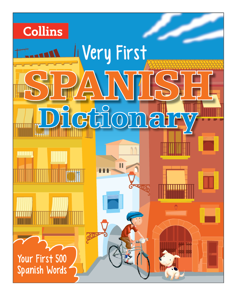
The foreground buildings for the Spanish cover are red and yellow of the Spanish flag. I didn't try copying the layout of the flags' red, yellow, red, horizontal stripes, but now I come to think of it that might have worked quite well. Collins were very happy with this artwork.
The colours are much richer on this cover reflecting the warmer climate.
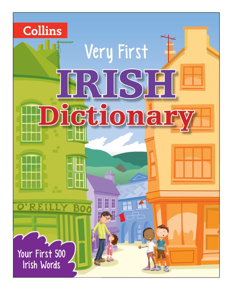
Continuing the theme of using colours from the Countries flag, the two buildings in the foreground represent the green and orange of the Irish flag. I have muted the colour of the sky and background reflecting the colder northern climate.
These are the final font and backs for the French and Spanish titles.
It was finally decided that it would make a clearer cover to have more sky and give the text room to breathe.
As there was more sky and less detail to the background, I added a couple of additional details to give life to the scenes. Three small birds, front and back for the Spanish title and a pigeon taking off on the back of the French title. Also a jumbo jet in the sky.
The client were extremely happy with the series of covers.