The brief was to produce a character logo for a new website selling quality dog food and accessories from various companies in one shop.
My initial sketch, talking over the phone with the client, was in the shape of a basic triangle with the nose as the left point and the ears as the top and right. This uncluttered shape would help keep the logo design simple and memorable.
Below are more detailed drawings, with three different eye styles. The tongue was made much bigger and more doglike, licking it's lips. The white outline of the tongue in the middle carried through to the final design as it gives the tongue more definition which later was given the second corporate colour.
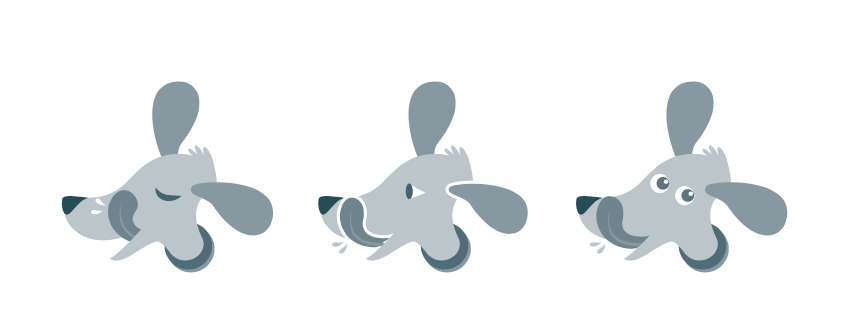
Here is the artwork with the company name included. The spittle from the tongue was also moved to above the tongue with more attractive eyes.
I gave the option of both ears being behind the head which the client was even more delighted with. I also had the dog facing right as the logo would also be used on social media where the logo would probably be placed left on the page. Much better for the logo to be looking in to the page. Below is the final design.
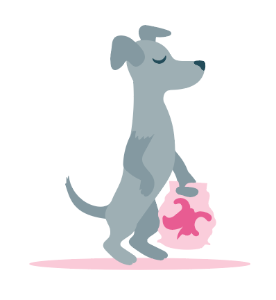
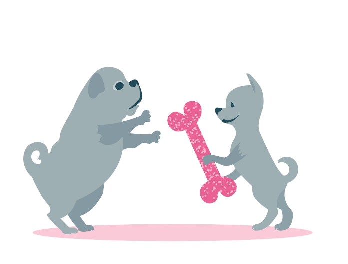
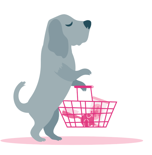
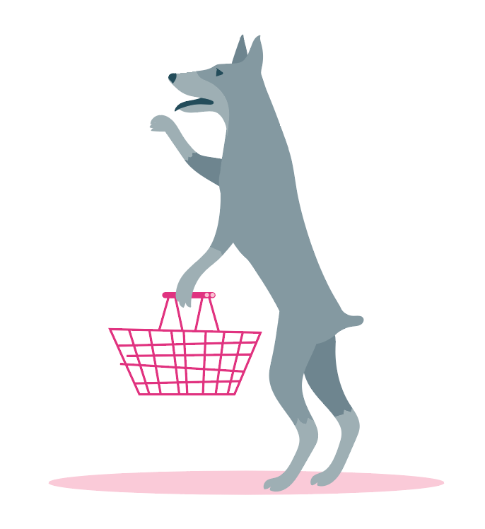
For the website page design, I tried to include as many types of dog as possible in a supermarket setting. It was fun coming up with what the dogs would be buying or browsing for. Most of them seem to have a quite dignified look. I'm sure this is exactly as they would behave in real life... maybe not with the baskets.
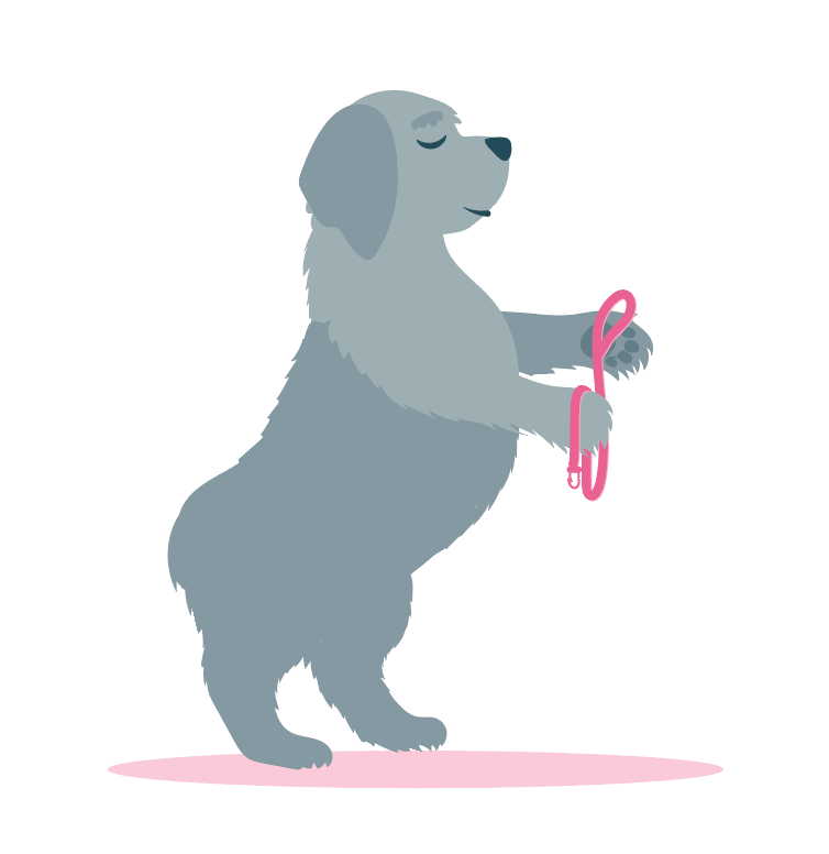
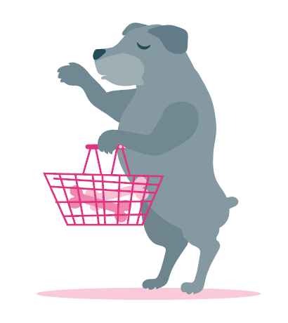
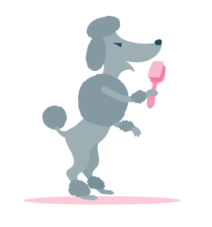
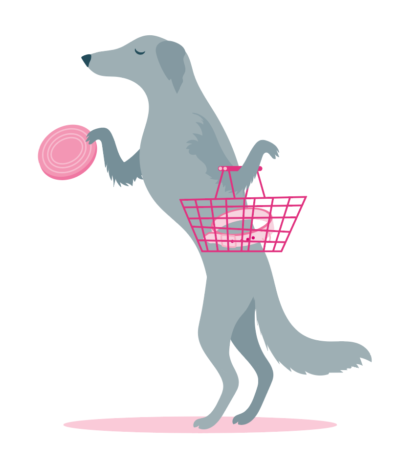
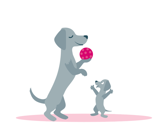
Below, the page design with page buttons added.
Here is a link to the Facebook shop. https://www.facebook.com/pawesomeshopping/
