
'My Wacky Forest' concept art, character design, logo design, book cover and internals.
Client: YGS Landscapes Ltd.
I first met Steve Warren-Brown of YGS Landscapes via Zoom in April 2021. I had been recommended to him to design characters for a new series of children's books to accompany a new micro forest educational scheme for local schools in the Plymouth area.
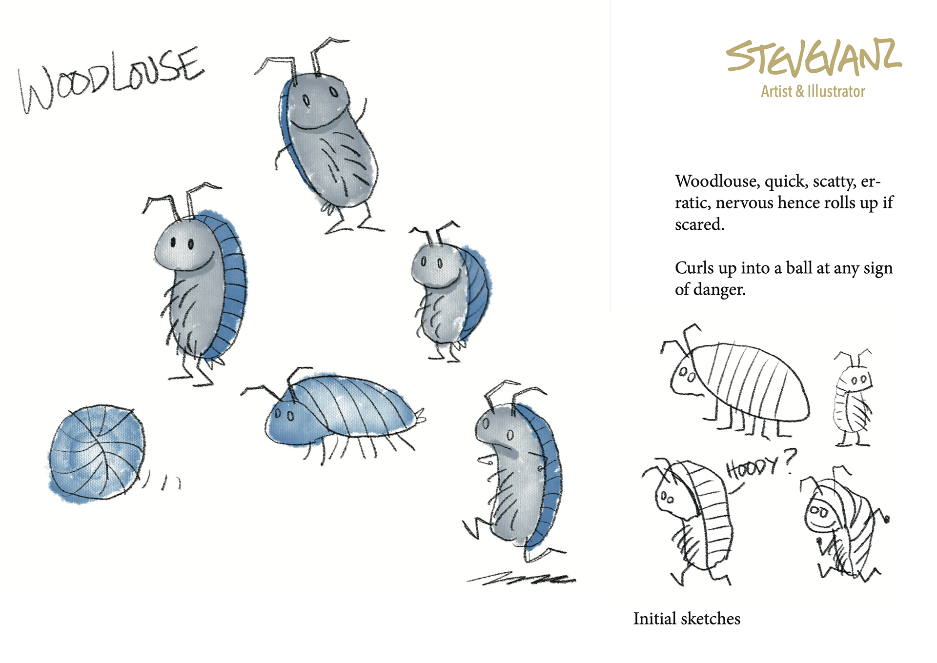
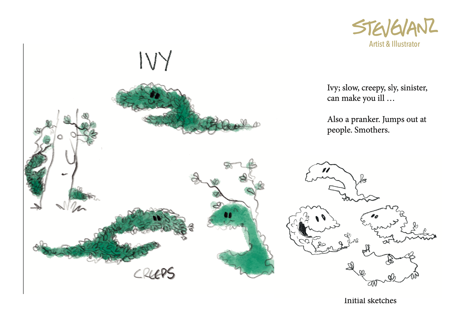
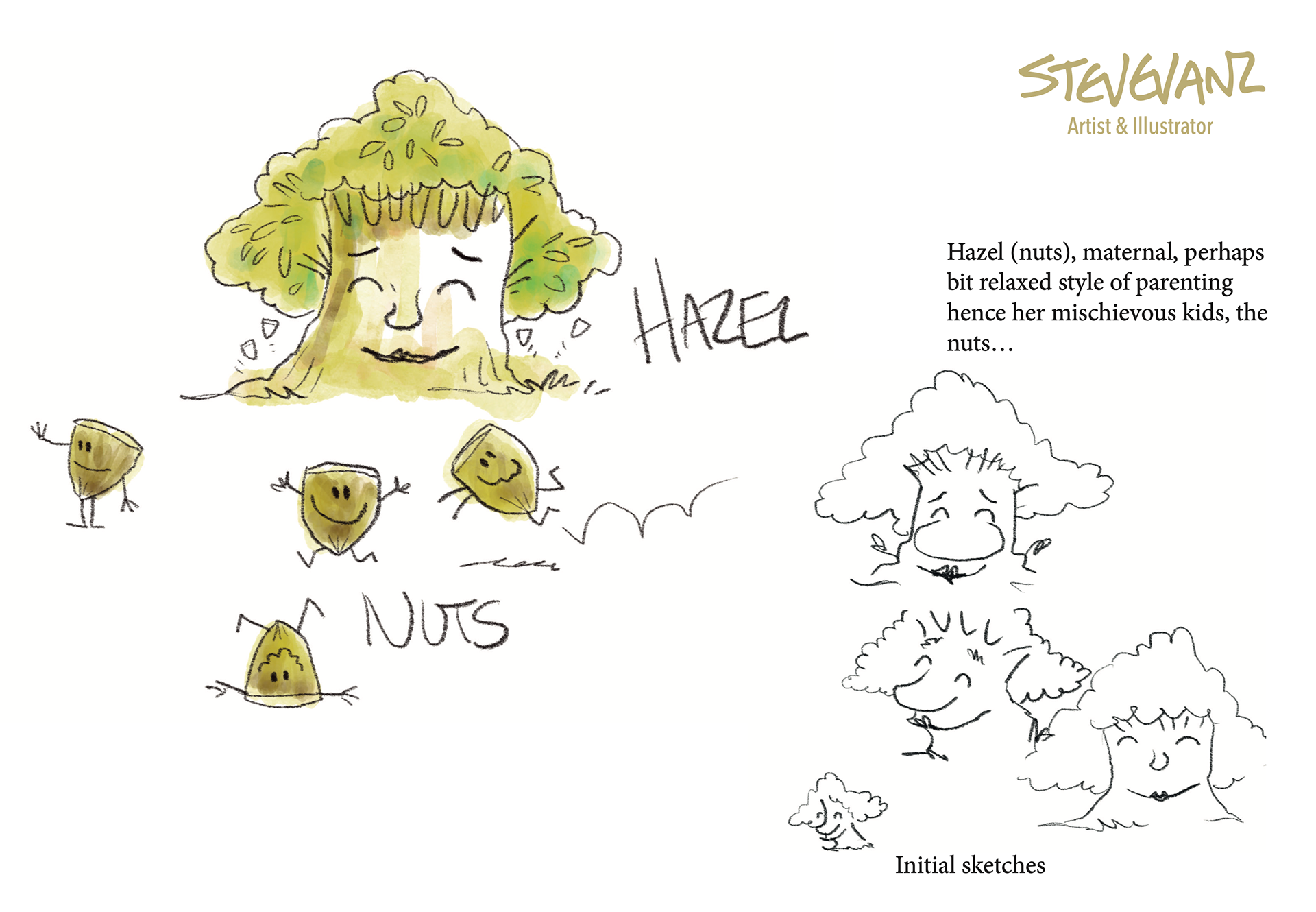
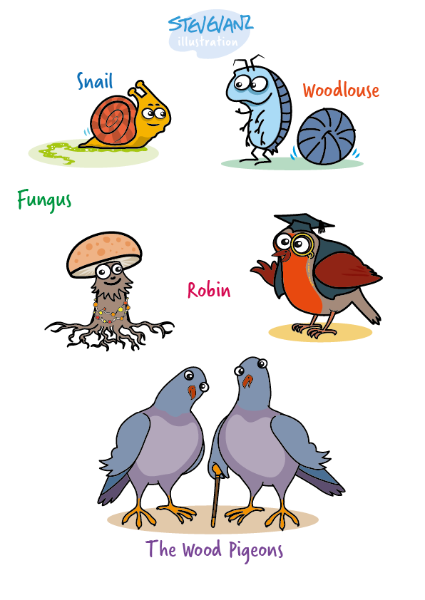
I was asked to come up with character designs for various characters that would live in the 'Wacky Forest'. I was sent a screen shot showing some ideas for characters.
I sketched some ideas and came up with the first concepts for the characters and logo.
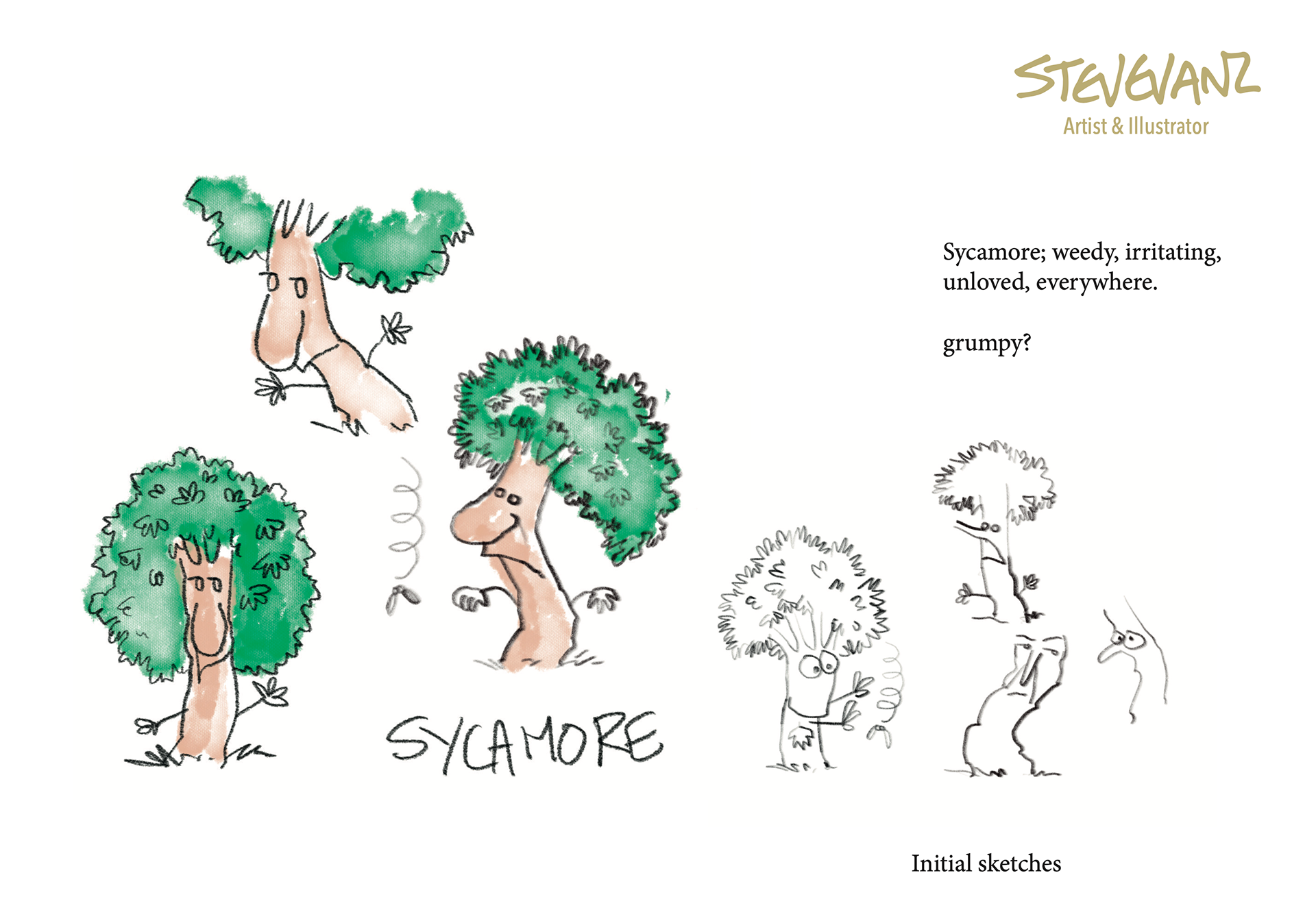
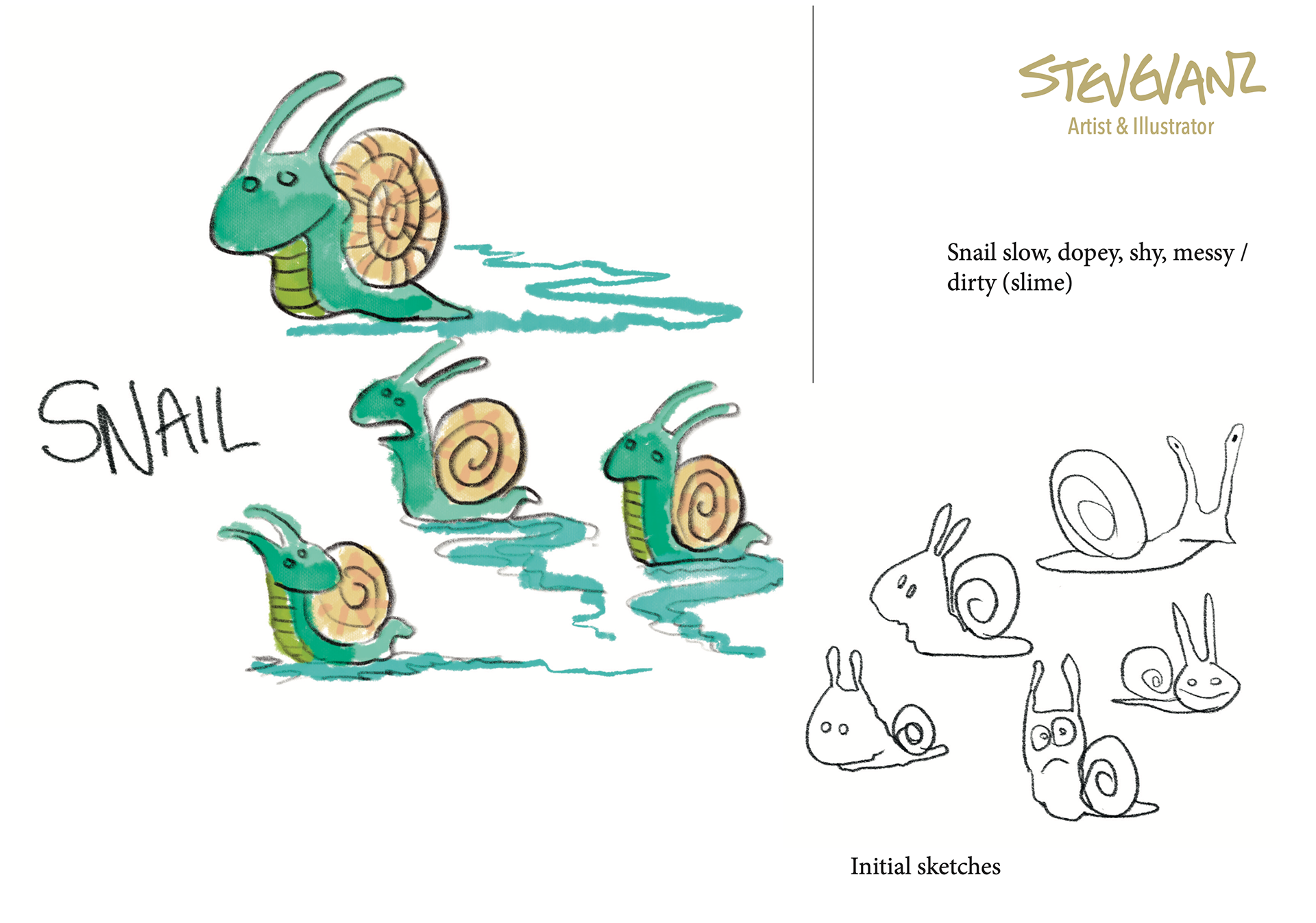

The initial response was excitement, seeing the characters come to life, the feedback was to make the characters a little more, 'wacky'.Oaky just looked too fluffy and only attractive to early years children (ages 1-3). Steve preferred the round eyed characters as in the Botton right of the Sycamore page and bottom right of the Snail page. The preference was for goggly eyes.
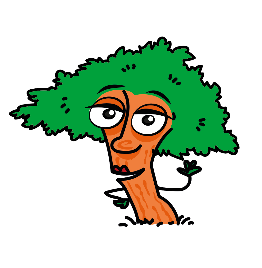
I worked up the characters to that brief and to make a more cohesive style. The wider eyes did make the characters more alive, expressive.
After this, there were only a few tweaks needed to the characters. Robins headgear was changed to a flying cap with goggles. Fungus's name was changed to 'Mushi'. And the Wood Pigeons became, 'Woodsie and Podge'.
The biggest change came for Mrs Hazel. I wasn't quite happy with the look. Her character is a nurturing soul with many children (the Nuts). She just didn't look friendly enough. Steve was happy with the character... until he saw my changes.
Below you can see the gradual change to the Mrs Hazel we know and love.


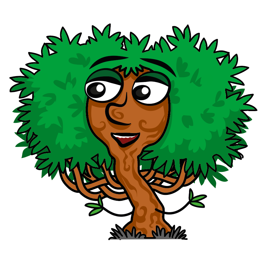
Design 1 - Triangular foliage shape. Older looking with narrow face.
Design 2 - Amended design, keeping the triangular foliage but with a rounder, fuller face with a friendly smile.
Design 3 - The final shape I was very happy with. I replaced the triangular shape of foliage with a rounder more shapely cut. Plus more turned up nose, larger pupils and eyebrows moved back into the foliage.
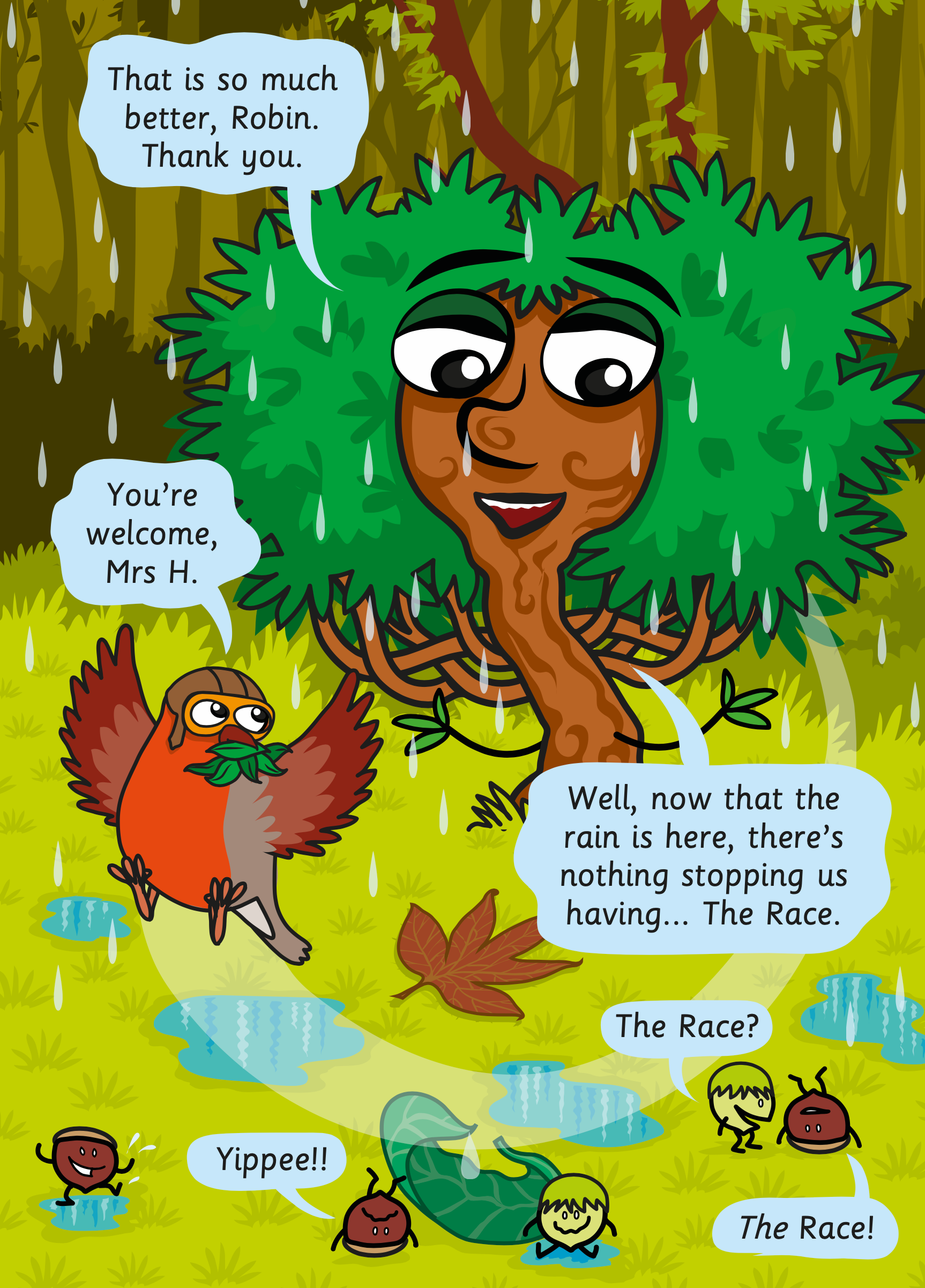
The final design with added 'layed' branches for Book 3, 'A Day at the Races'.
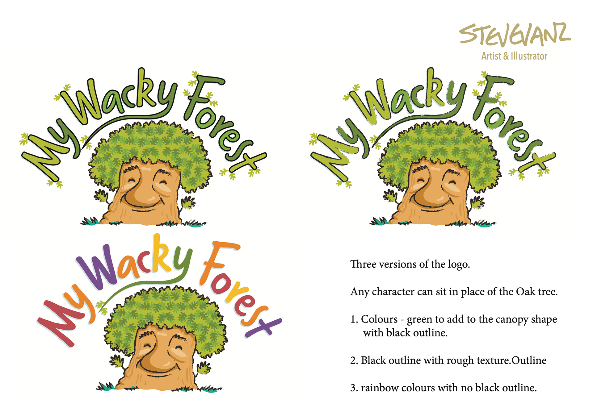
The next stage was book cover concepts with a series logo. I soon realised that the logo I had originally came up with wouldn't work on a portrait shaped book cover, or would be too small. The logo needed to make an impact in a series. Easily recogniseble at a glance.
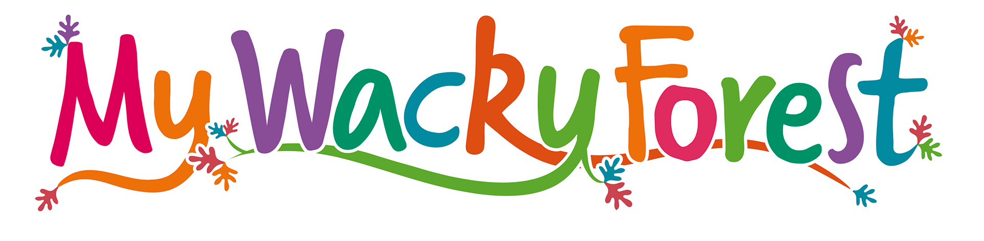

The first design, I reworked into a more compact circular shape.
I overlapped letters to represent growth, vines, roots.
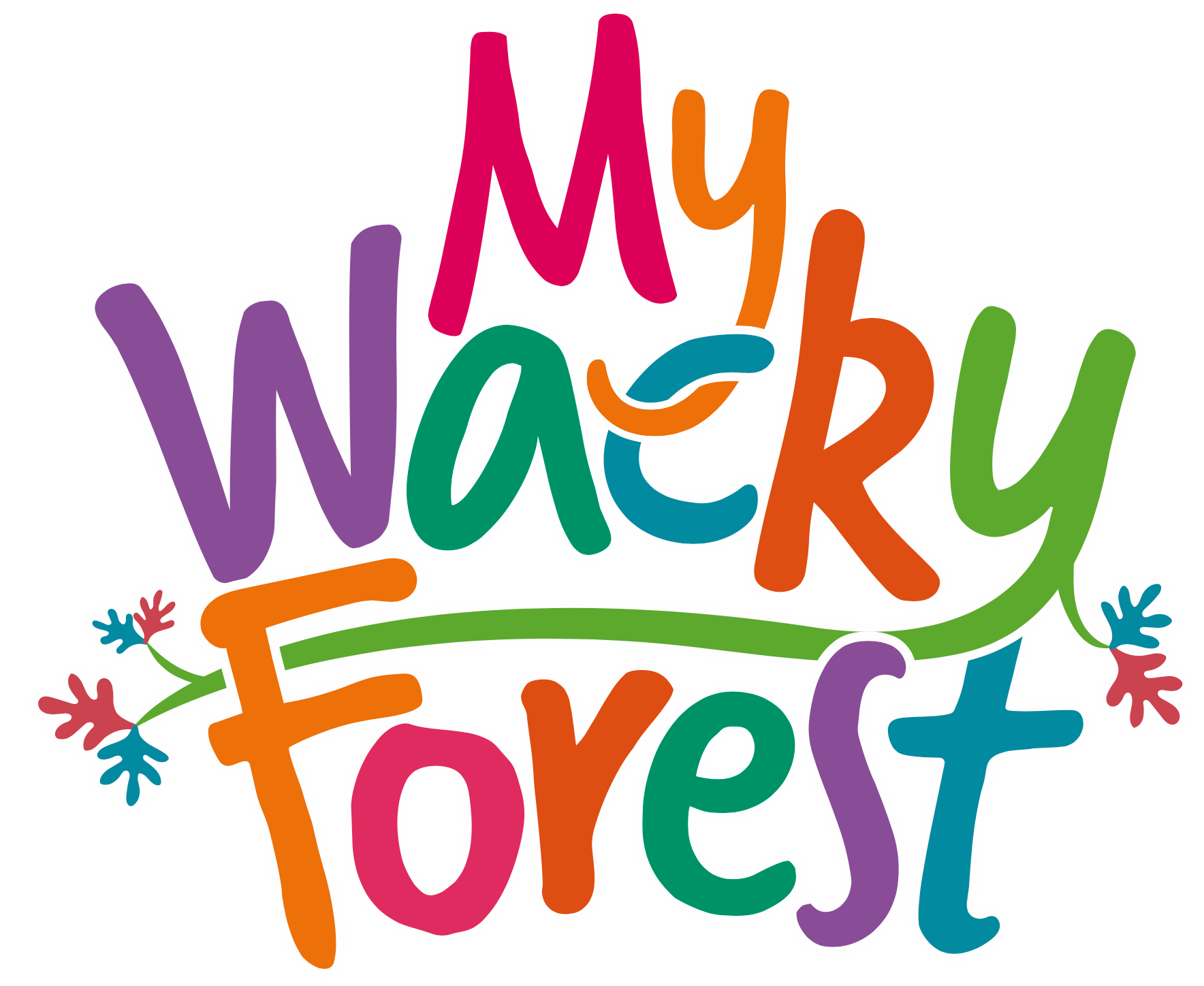
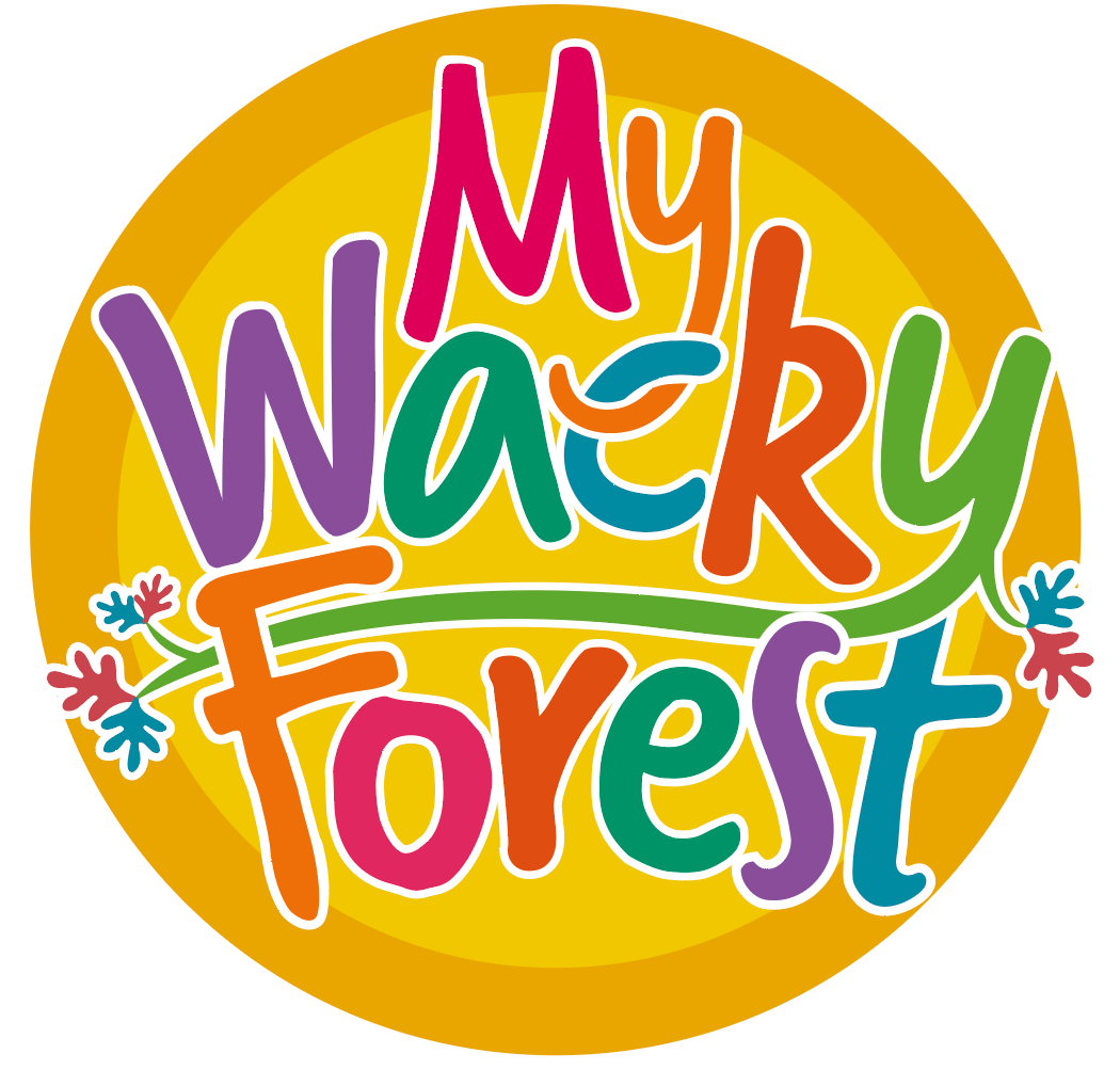
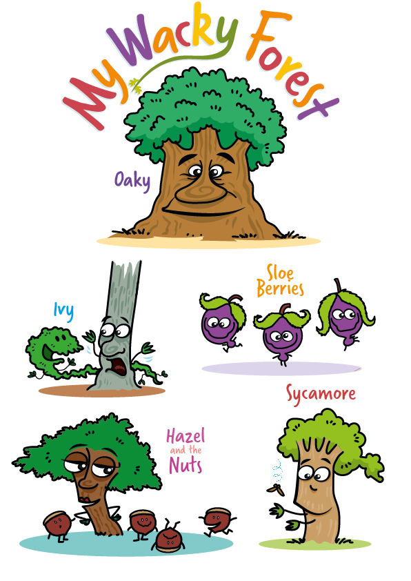
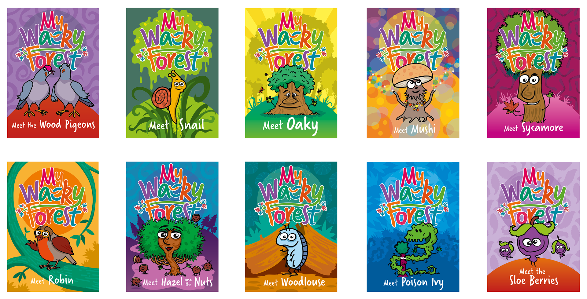
I then worked the logo into a cover/poster design for each character. This showed the scope and flexibility of the logo. It also helped me choose the complimentary colours for each letter, avoiding clashing with other colours on a page. There are seven colours in total, magenta, light orange, dark orange, lime green, purple, teal and blue. The oak leaves were chosen to represent the spiritual centre of the forest, 0aky.
This has been an exciting project to work on which I hope to be involved with for a very long time to come.
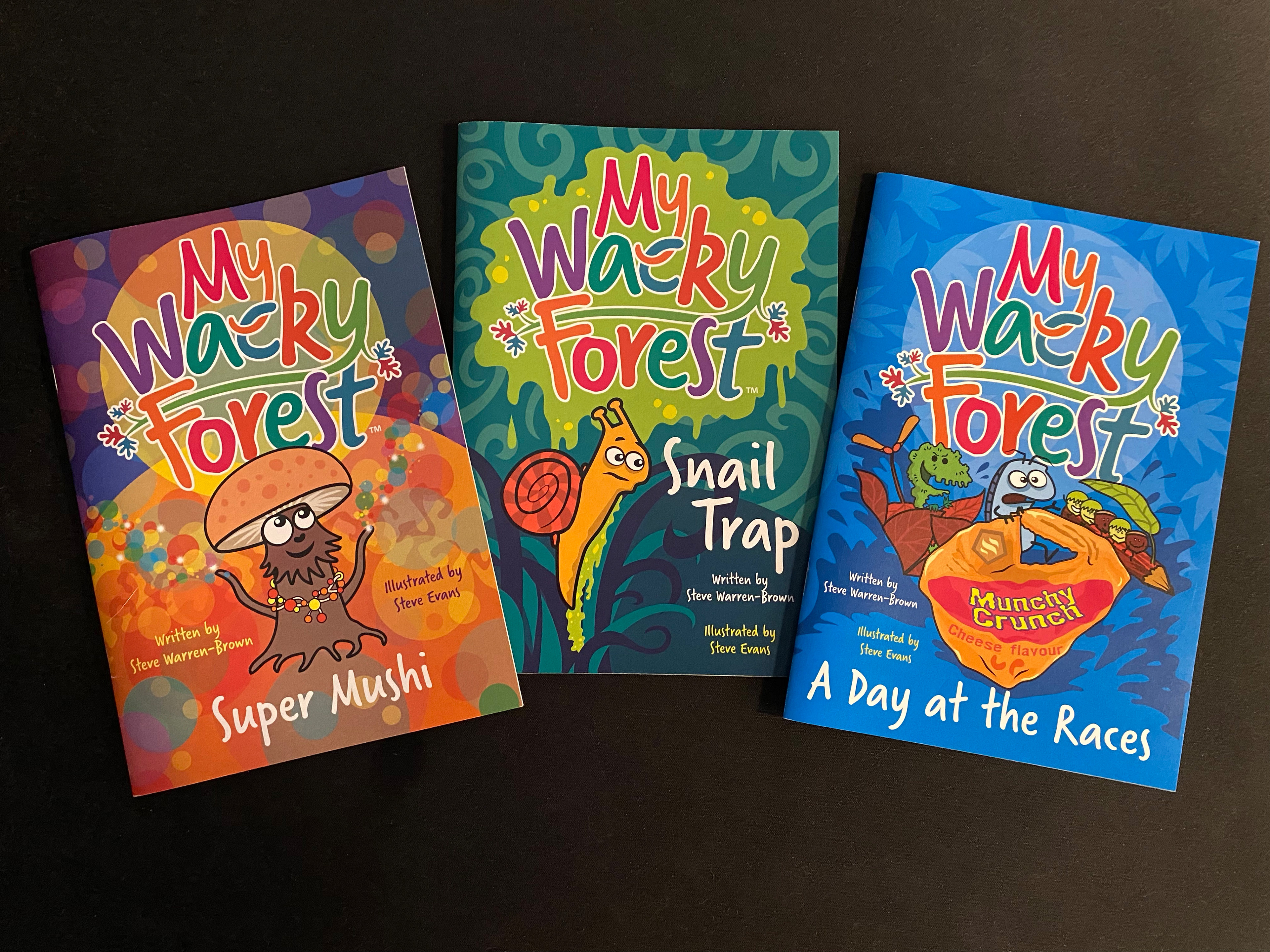
The final covers of the first three story books. There is a section for each book in the 'My Wacky Forest' page.