A collaboration project to produce a children's picture book based on a honey bee with allergies. An exciting project to be involved in and a wonderful experience. The kind of work I love to do 24-7.
Boris sneezing stills.
I had been working with Harper Collins Editor, Mark Steward on a Primary Maths series. He approached me with the idea his son, James had come up with for a children's picture book.
James had the idea of a bee who has allergies from pollen. He even had a title, The Bees Sneeze. Mark's friend and author Richard Happer would be working on the story. I thought the idea was fantastic and was very happy to jump on board.
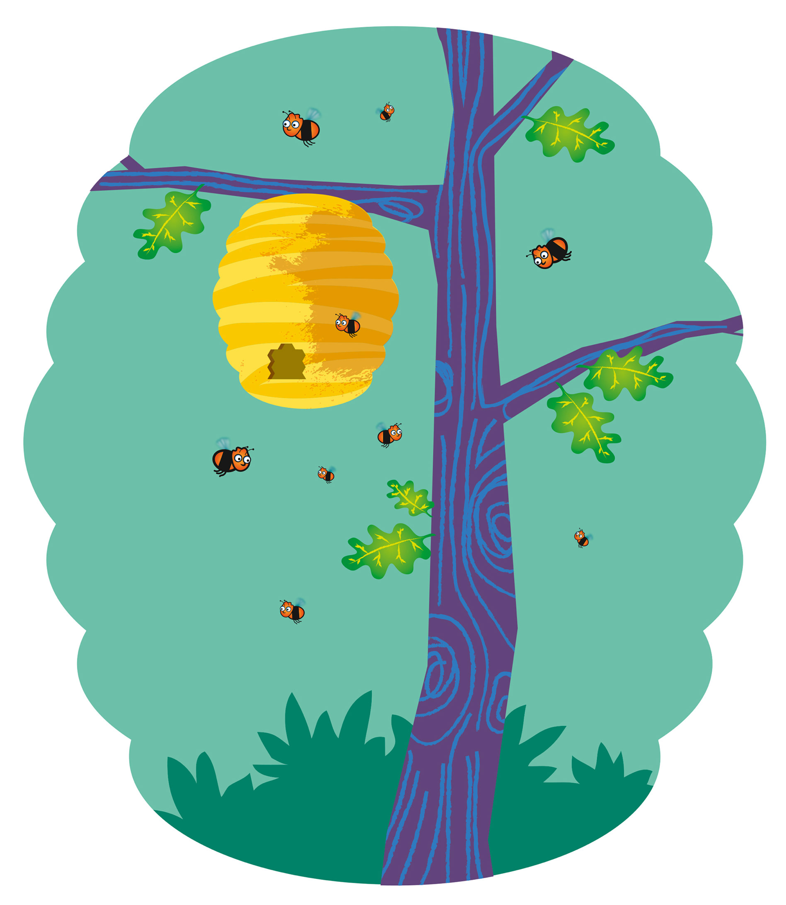
I was sent a draft of the manuscript with thumbnails of how mark saw the pages looking. Some of the pages showed full page illustrations but quite a few were set in a window. I tried a device to have the window as something more interesting than a simple rectangle and went for a hive shape. I think it adds energy to the image. The bees drawn in the first image are of a basic shape and look with little detail. All bees look the same, right? It is only when you look closer at their world that you see that they are all individuals. I hope this gives the young reader a feeling of opening a door into a bees 'Wonderland' .
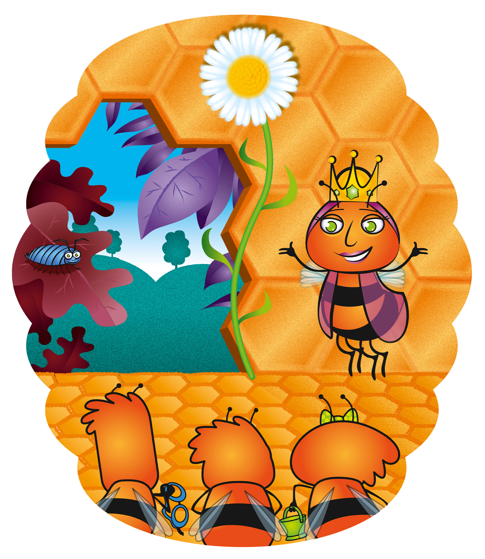
The second image shows the initial design for the queen. The final design has a more interesting shaped head and body, very Victorian Aunt. I wanted to make her more friendly and maternal, sort of like the good witch from The Wizard of Oz.
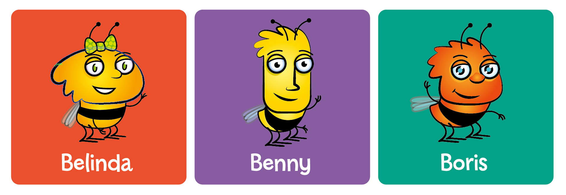
The third image shows our hero Boris with his friends Belinda and Benny, with the ever resourceful Bernard, nearer the ground. Being blind he has a helper to guide hime around the hive.

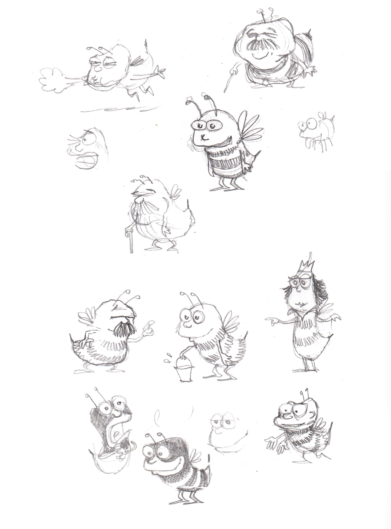
Below are a few of the many sketches I produced of the main characters. The bees began to resemble how Mark and Richard, and more importantly, James, had imagined them to look like. I also decided to create bees that I hadn't seen in any other media before. It was a tall order to not be influenced by the many styles found in animated films, TV and children's picture books.
I would open a blank page of a large sketchbook, and just fill it with quick pencil sketches of bees in various activities, but mostly collecting honey. I initially reduced the total legs to just four. I imagined six would look too cumbersome. I later rejected this idea when I came up with the idea of having four legs acting like two and the front legs as arms.


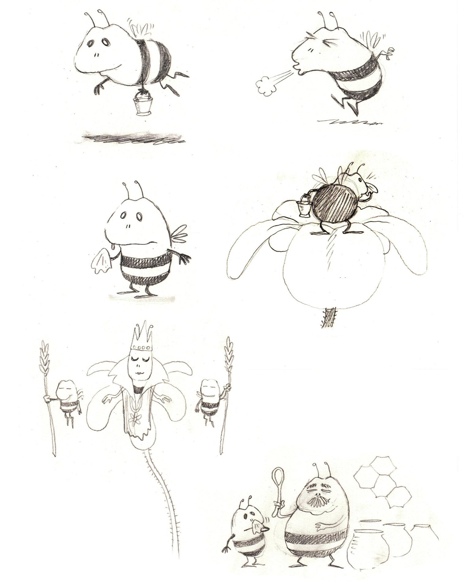
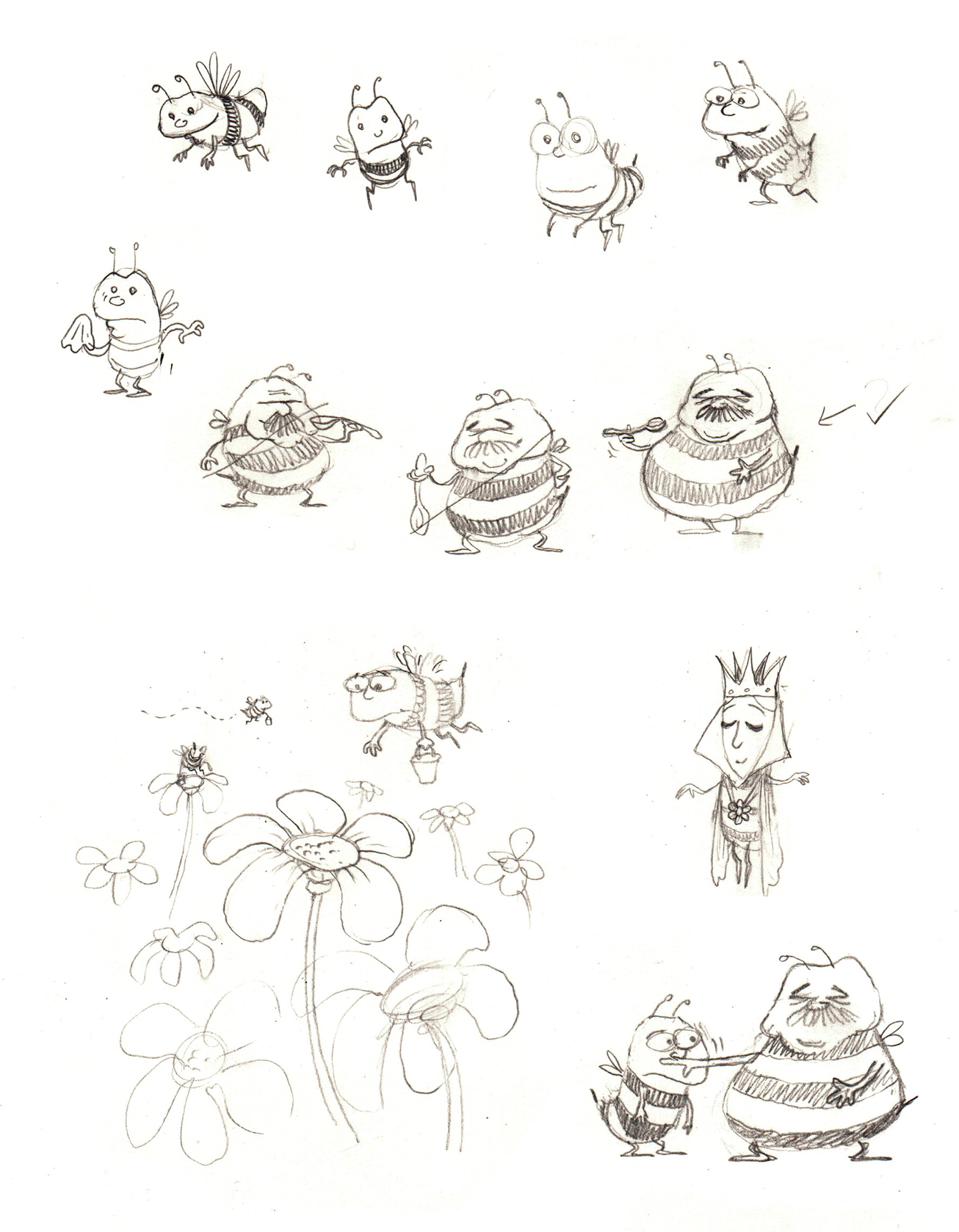
The final look of the main characters. The bees heads started out with a generic round bee shape. I then stretched and kneaded them into the individual shapes to be instantly recognisable by children. Visual shorthand. I also reduced the number of black stripes to the bees body to simplify the design further. There is only one stripe to each bee except for the Queen with a longer body which can accommodate two. Below is the Title page.
The final pages...

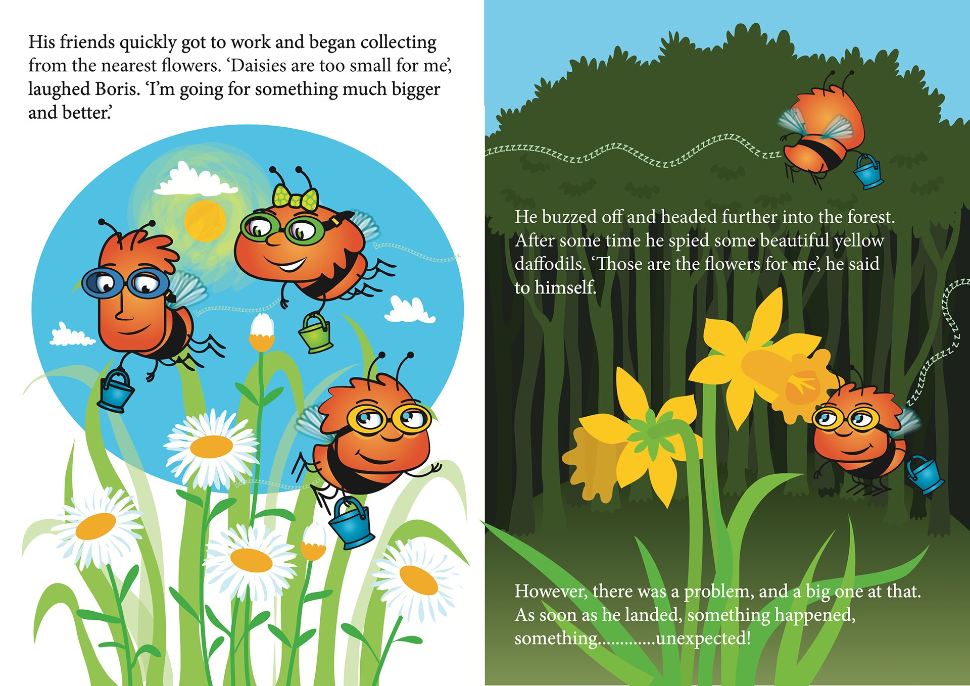
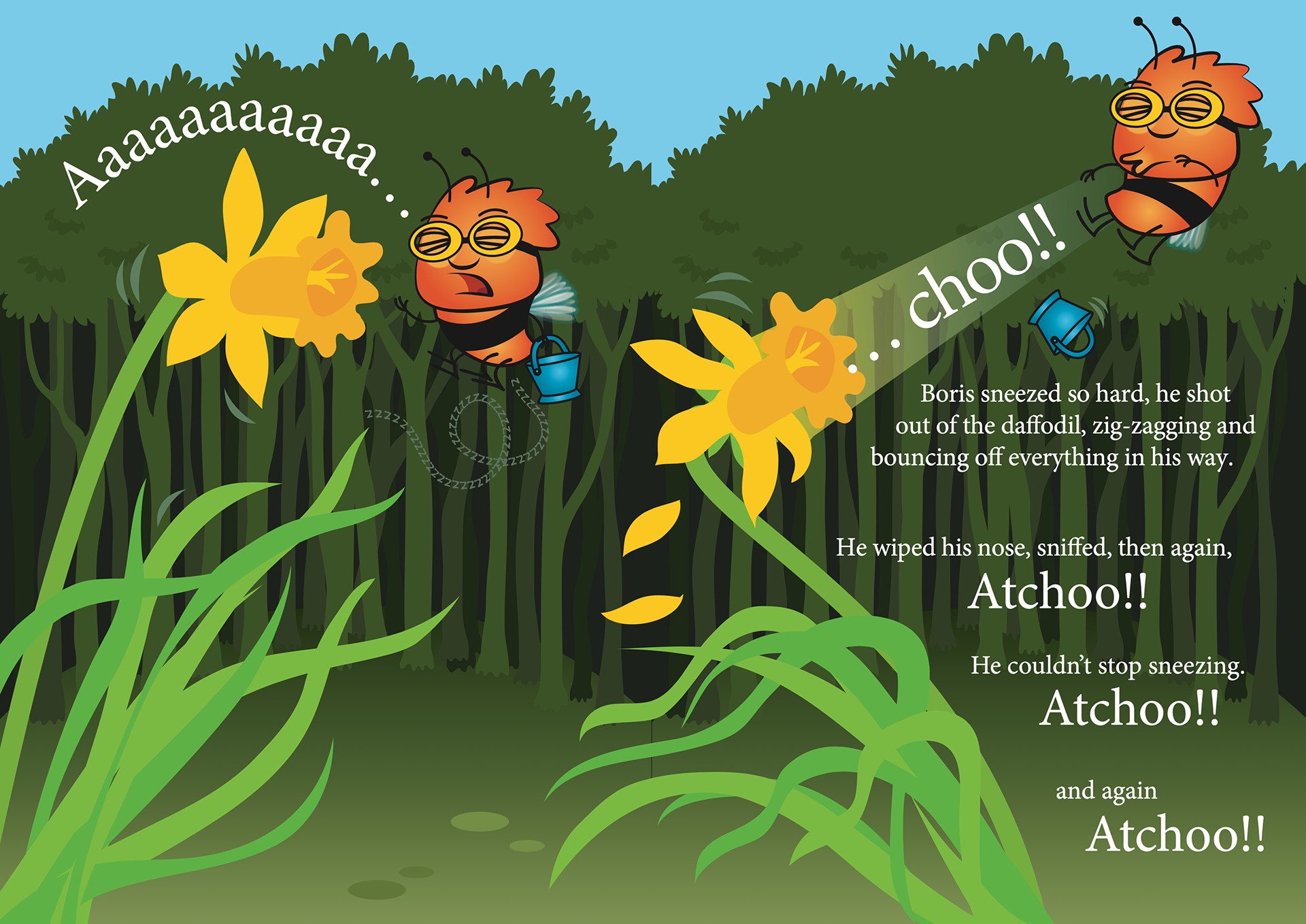
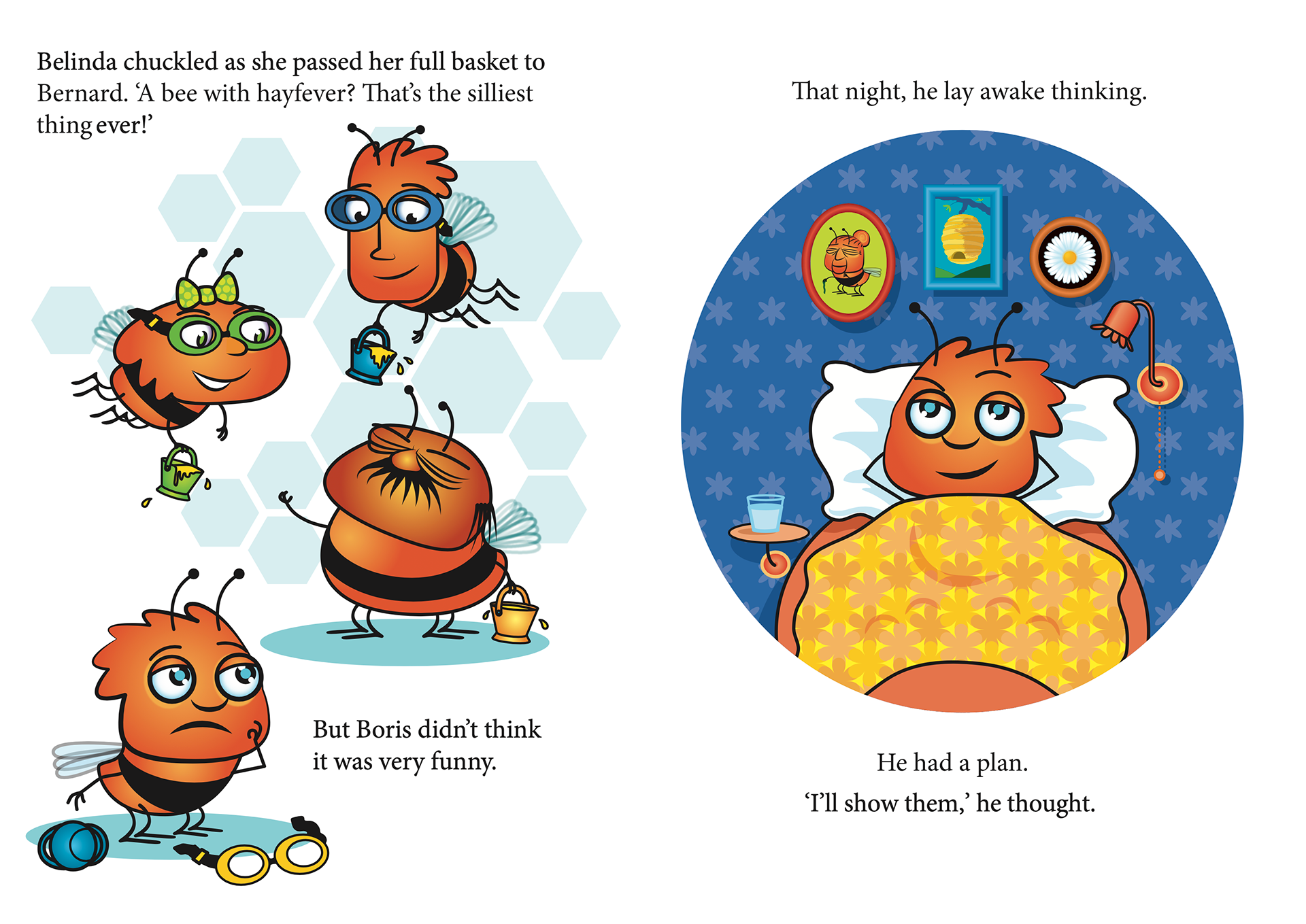
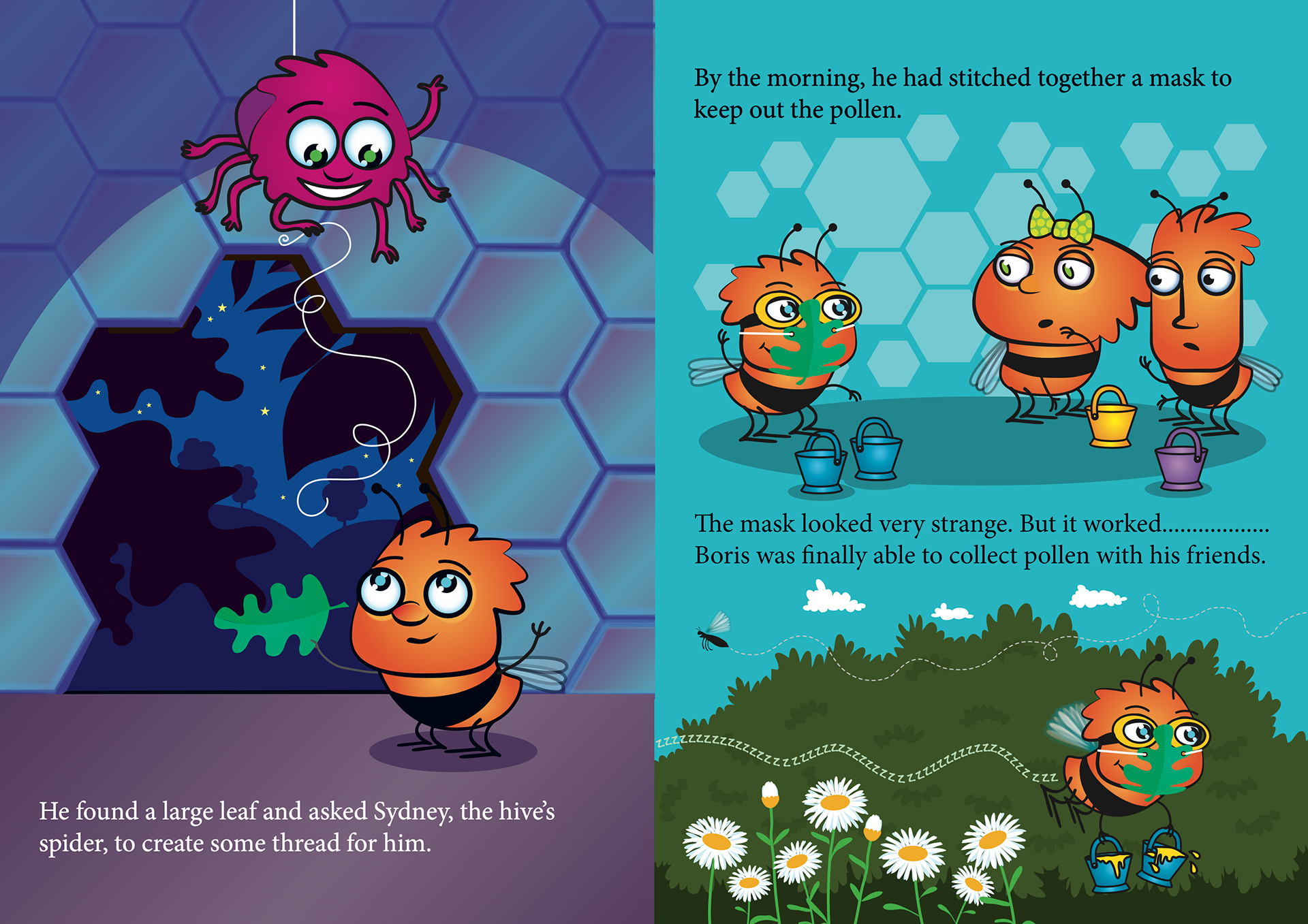
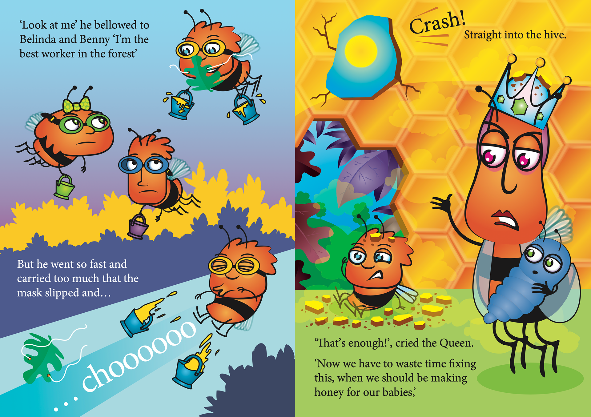
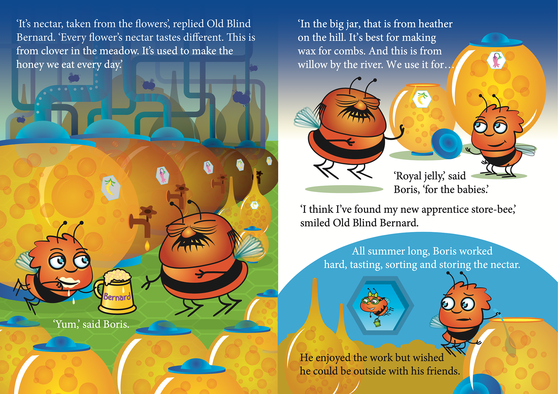
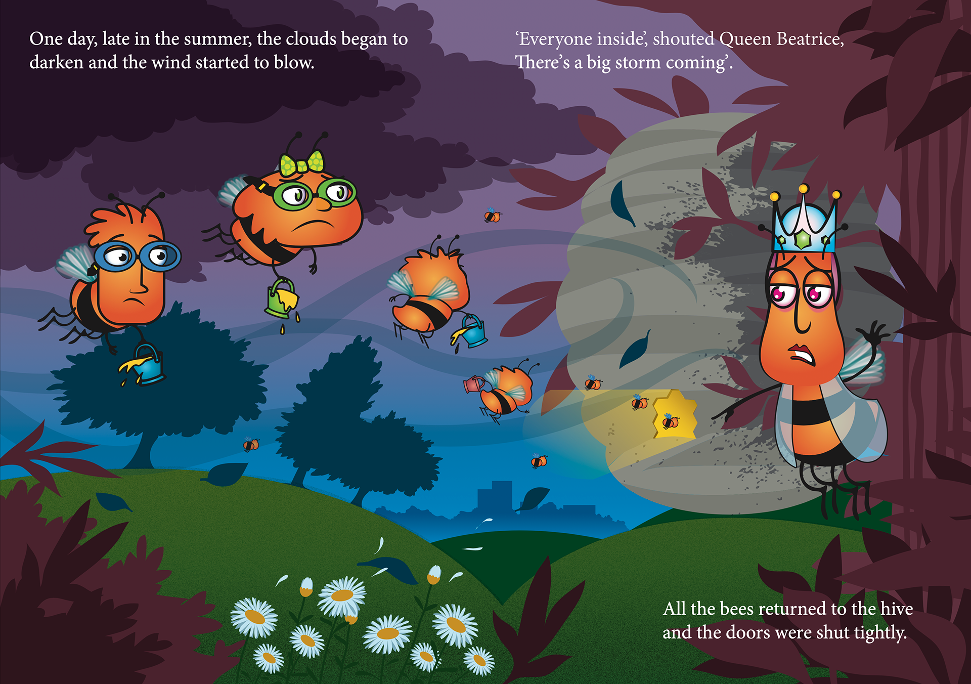
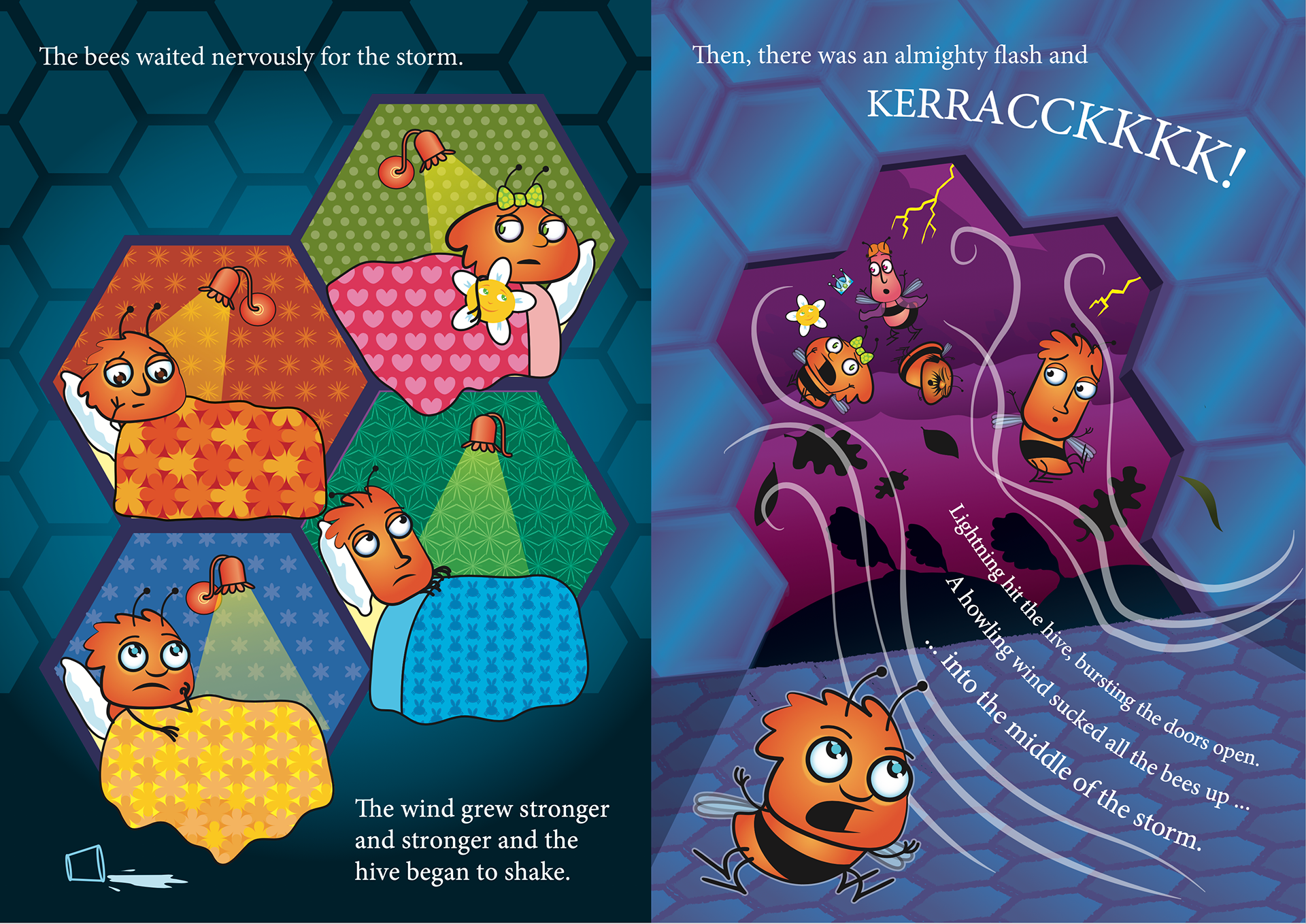
... you'll have to buy the book to see the ending.
Having worked in the educational publishing world for the last over twenty years, I couldn't help but put together two posters showing a bees anatomy and the layout of a hive.
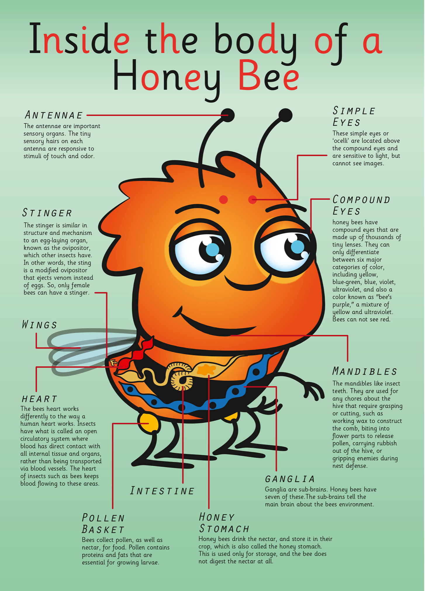
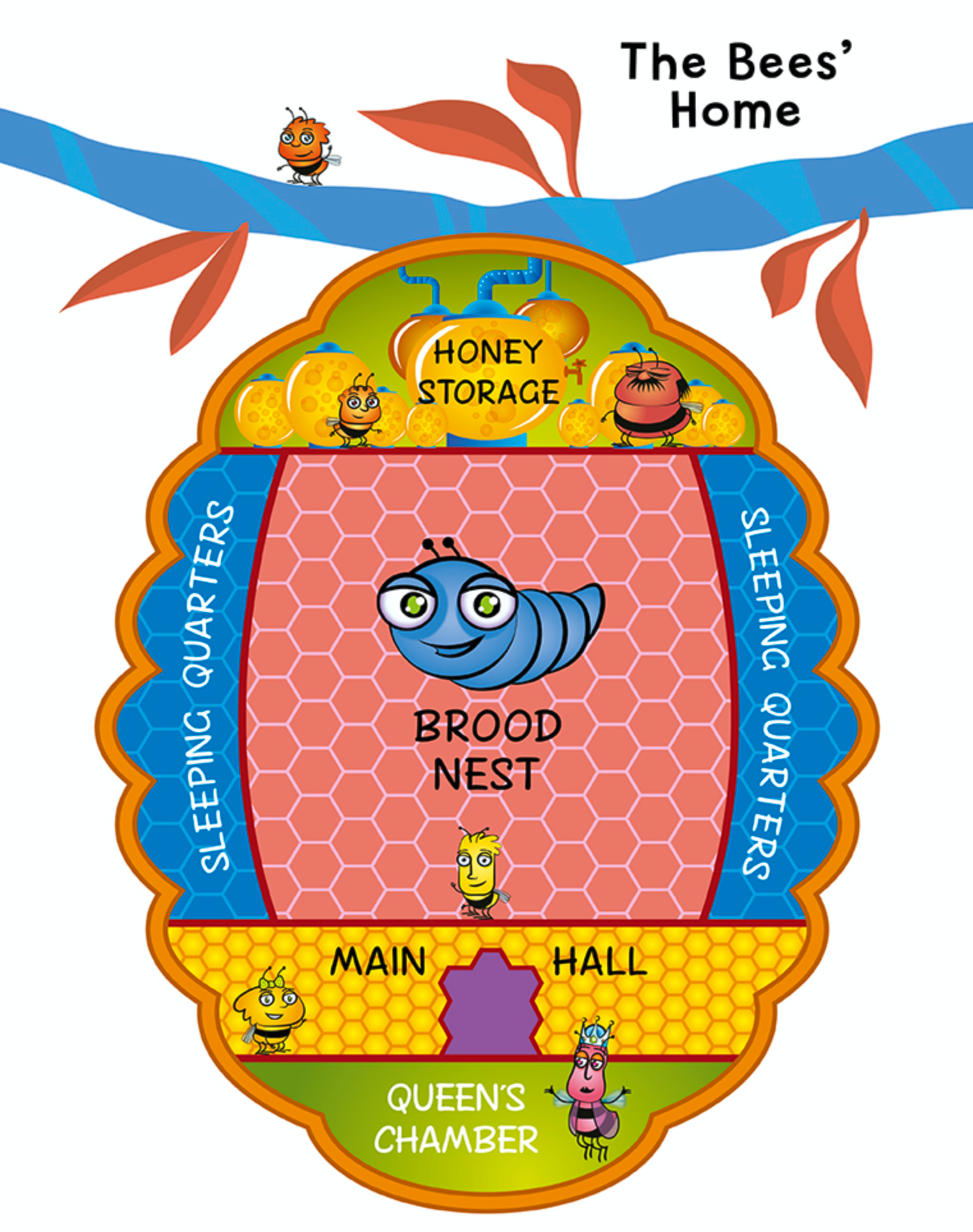
And here are the final designs.

Below is the final cover design and beside it a design for a third book in the series.
The second book in this series has the idea of character Belinda finding her sting has started to grow and all that entails. This is a big deal for female honey bees.
A publicity article showing Mark and James.
