
Full design of this successful KS1 and KS2 Mathematic series for Hachette.
I was commissioned to design and illustrate six Pupil Books, six Teacher's Guides and six Practice Books. This included the creation of two characters for each year.
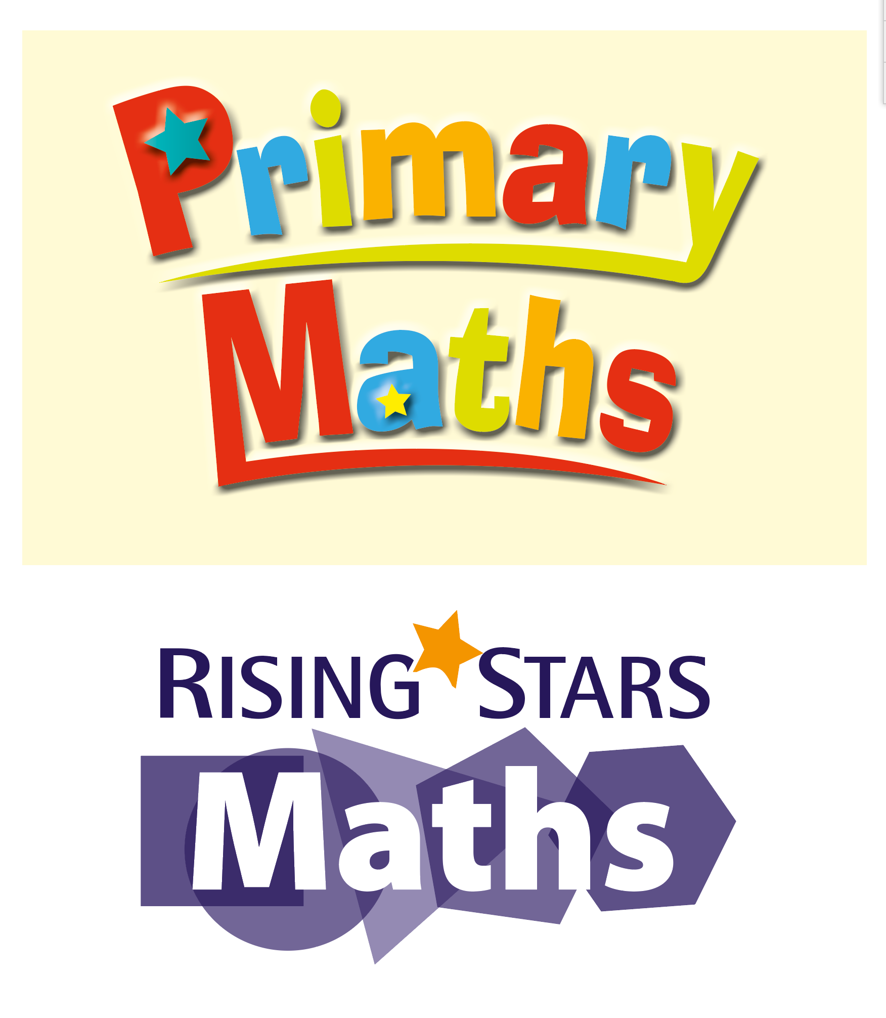
I also created the logo used throughout the series, marketing and web use.

Below is the design that won me the tender to produce all series content. Looking at it now, I can see my love of 50s American cartoons has influenced the design. Above all I wanted to design a maths book that I would have loved to have used as a child. Friendly, warm colours. No stark white background to the page.
I believe this is what stood out from the competitors.
It look a lot of work with the editorial team and publisher to refine the design and it was worth it. Below you can see the development from the above concept to the finished design.

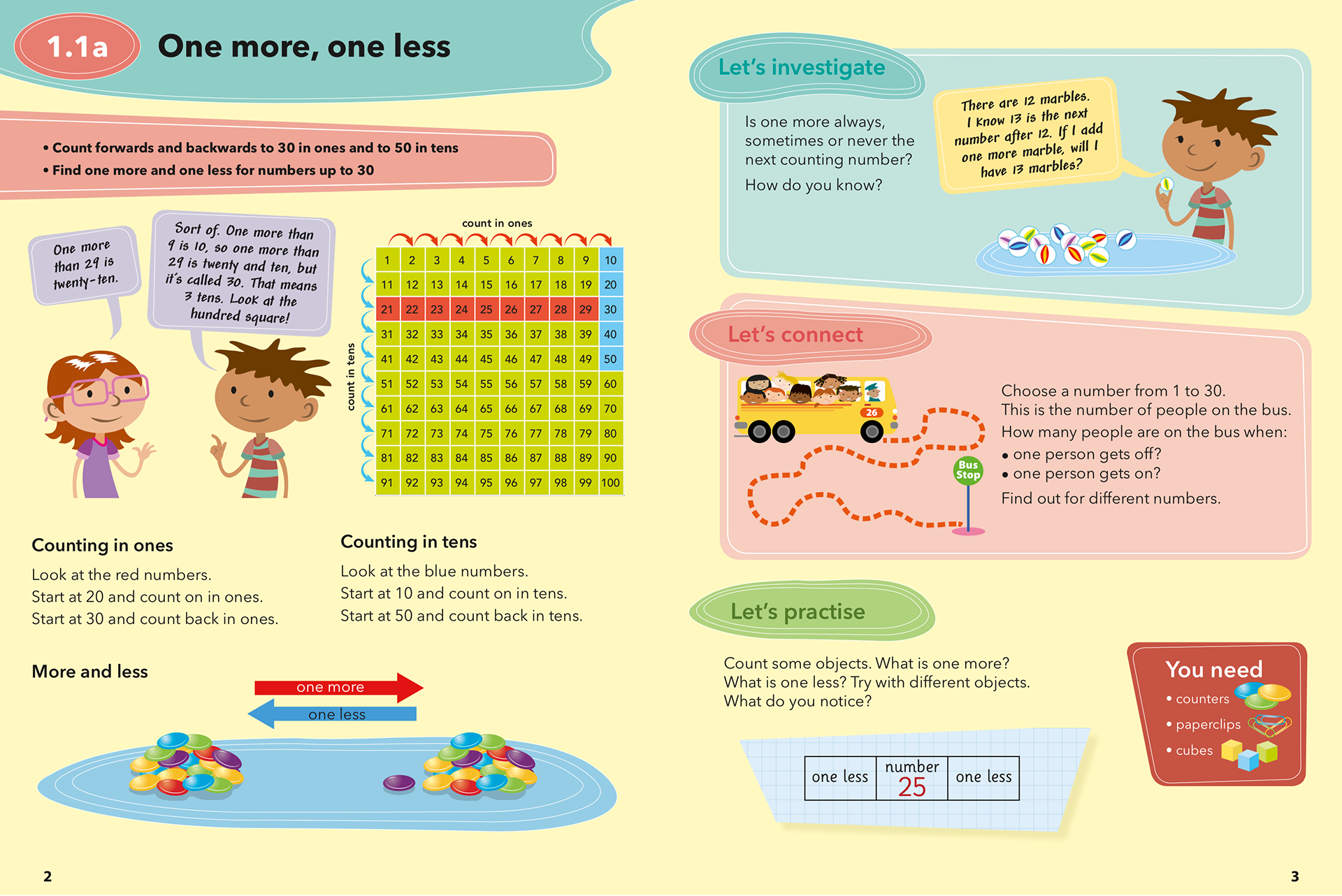
It was agreed that it would be better for clarity if each exercise were to be in a white area on the page. Also to use more of the page for content.
Below the main change to the design was to use the colour code system on the right page above, but to use the star symbol and to number each exercise. This also gives more needed content space and gives the page a cleaner look without losing the fun aspect of the design.
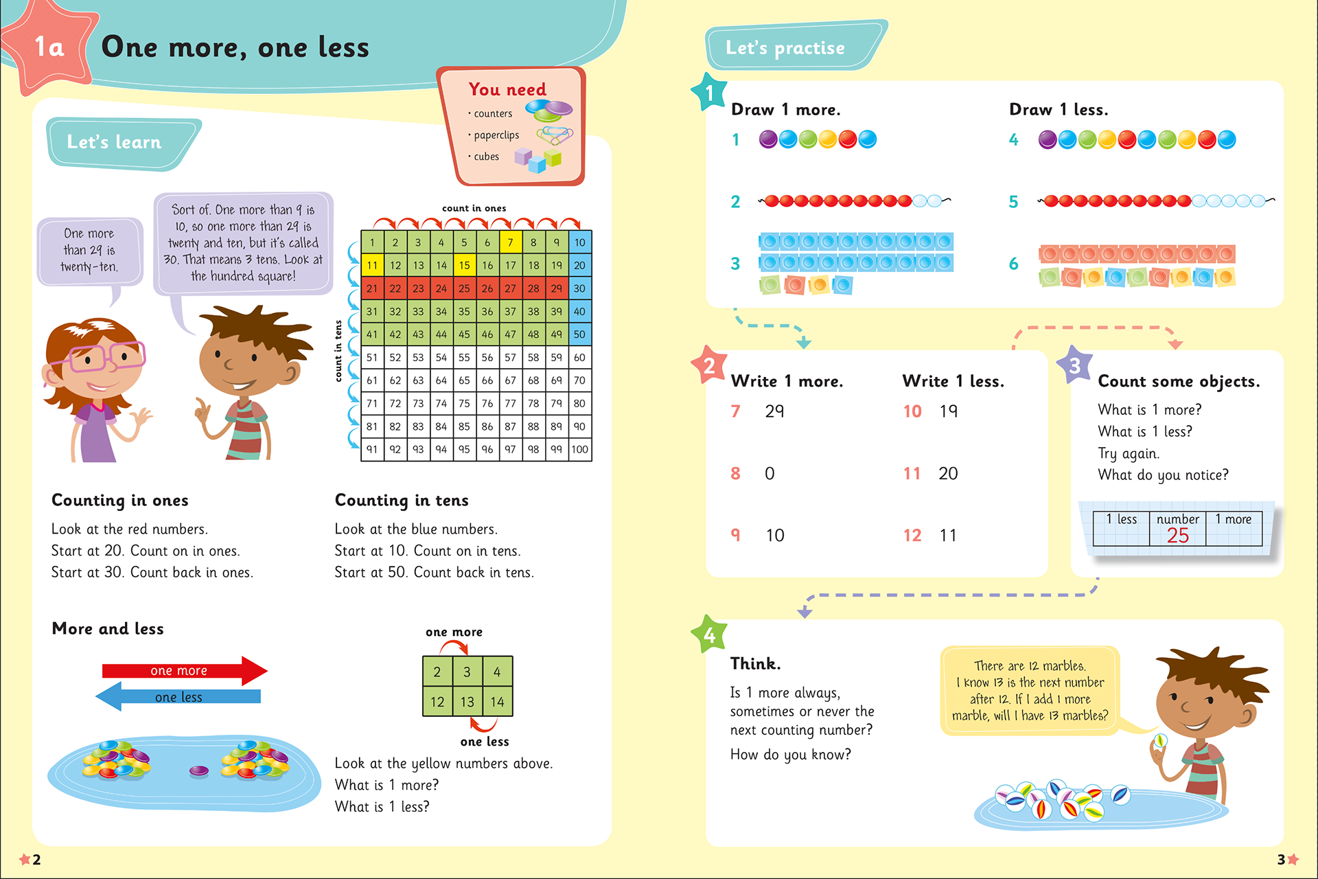
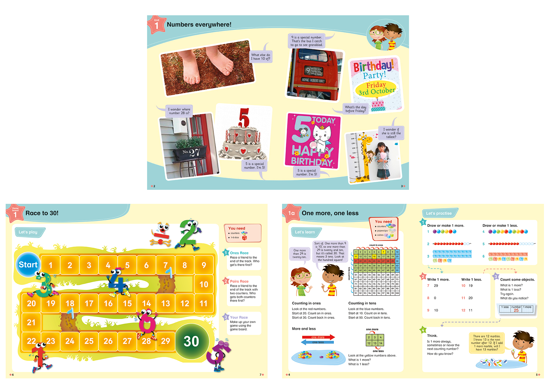
Below you find the final design. This shows the chapter opener spread, in which the teacher can discuss the chapter subject with pupils using the images and questions to encourage discussion.
The next spread is an example of the game pages. A game board is included with each chapter.
The final spread shows the final spread from the examples above, with the updated characters.
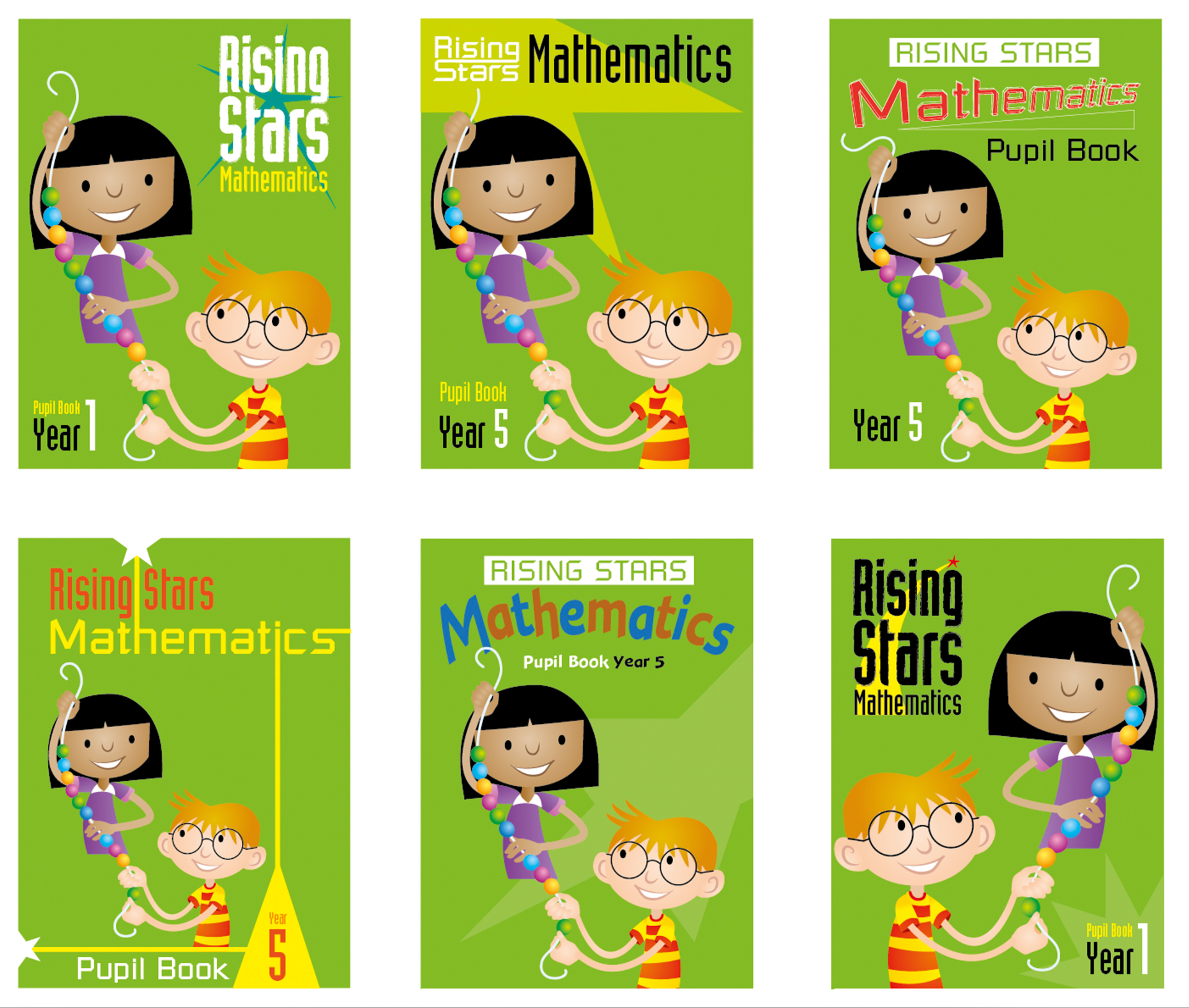
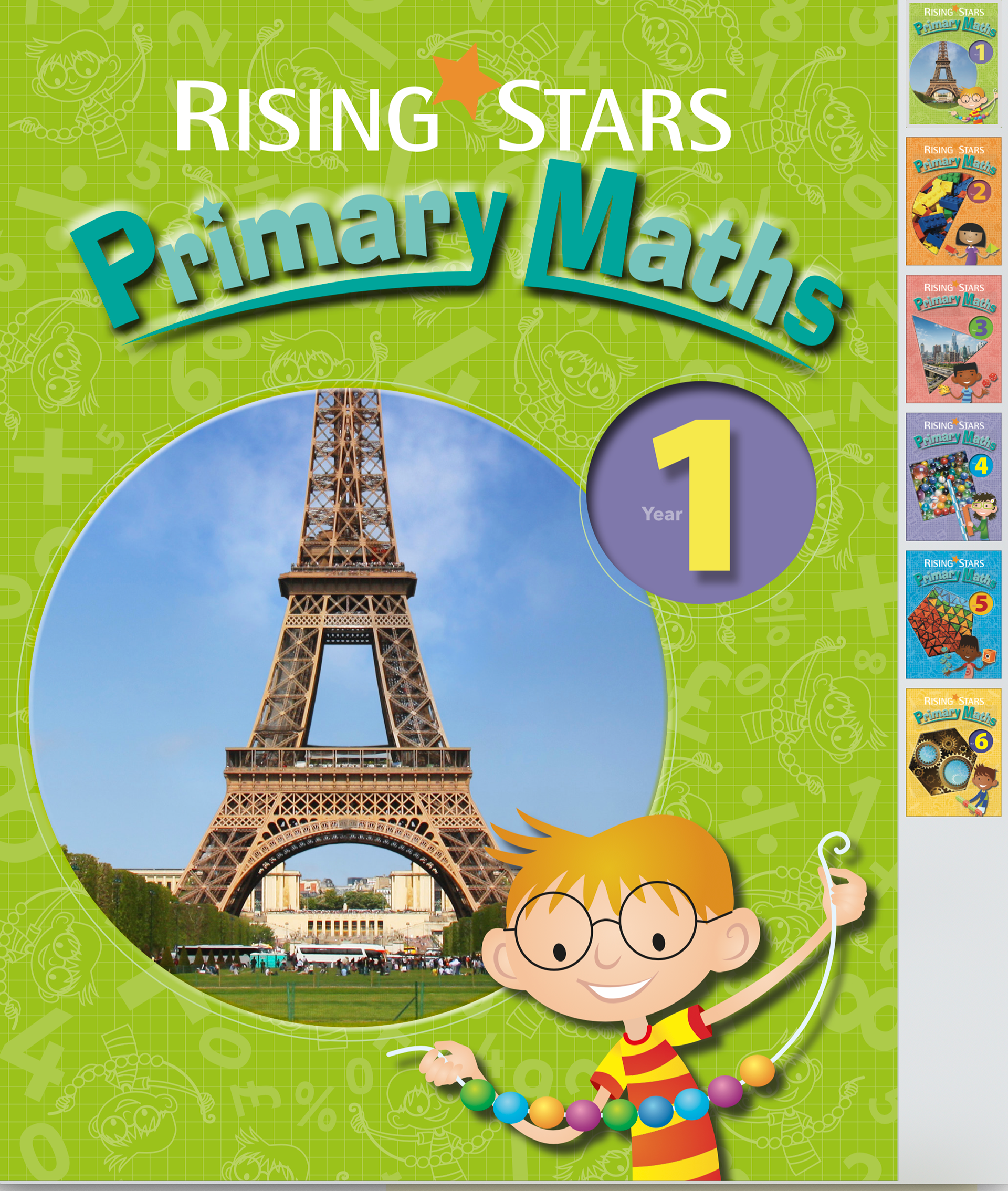
Once the initial concept for the internal pages of the series was approved it was on to the cover designs.
Below shows the process I use to get ideas from the client. A kind of mood board of ideas. I find it usually takes a few visual ideas to help a client realise their likes and dislikes. To get ideas flowing.
I came up with many ideas...
Many ideas!
Below is the final approved design, with the final logo in place.
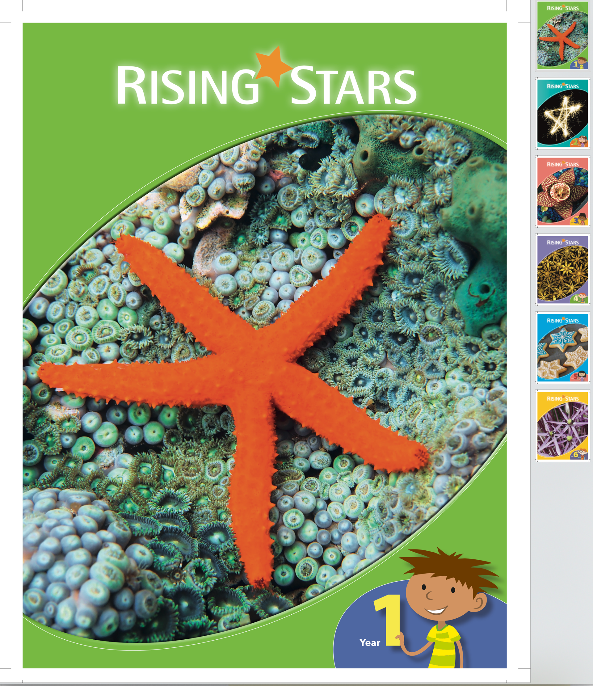
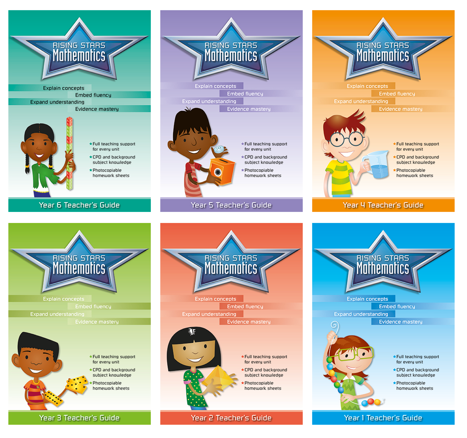
Teacher's Guide covers
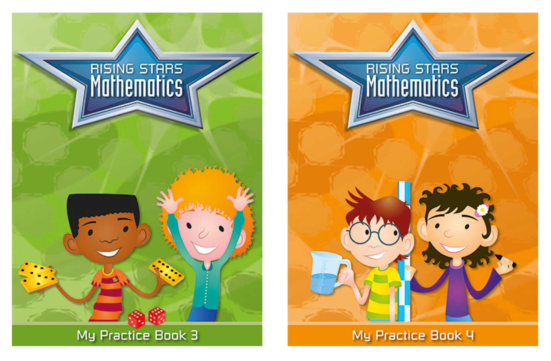
Two of the six Practice Book cover designs.
After the covers were approved I then moved on to ideas for the series logo.
Below are a few ideas. This includes a colour breakdown and a concept sheet of six cover ideas.

I was also asked to come up with some patterns that might be used for internal blank pages.

The client asked for there to be a more prominent star in the logo, more metallic looking. Happy with this one.

Hachette were delighted with the final product which led me to produce the online Reception year content, shown elsewhere in the Design section of this site.
For further details about this series please follow this link.
https://www.risingstars-uk.com/rsmonline-1